Checkout is the gateway to customer conversion, so crafting an effective checkout experience is the key to turning visitors into satisfied buyers. But out of different types of checkouts, how to choose the one that would work best for your business?
Let’s jump right into the world of checkout design by exploring nine unique checkout styles and pinpointing the scenarios where each of them shines. Choosing the right checkout enables you to make strategic decisions that align with your business objectives.
Checkout diversity is a great way of optimizing the customer journey and boosting your conversion rates. Whether you’re just starting off or have been selling for years, it is always a good idea to keep improving your online shopping experience.
One-page checkout
A one-page checkout condenses the traditional process into a streamlined one-page format, focusing on speed and conversion. It is designed to minimize any potential friction and reduce cart abandonment.
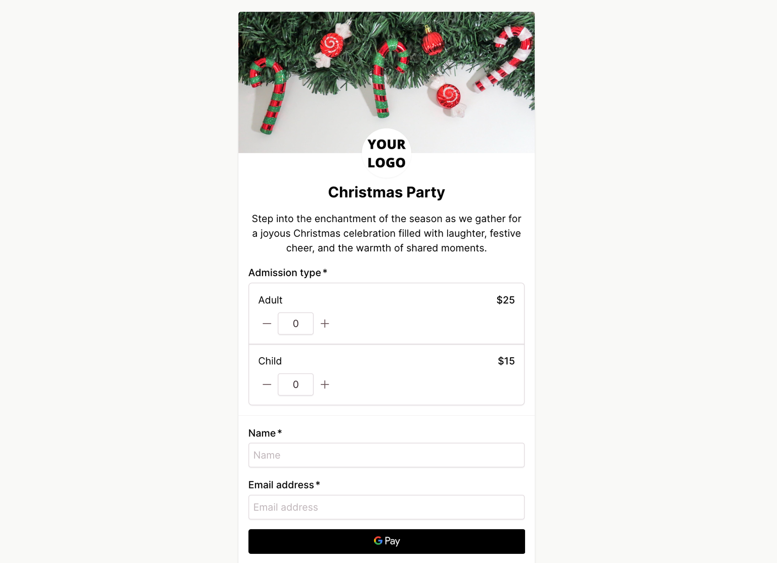
This checkout type is ideal for impulse buys as it suits mobile users and benefits single-product stores or businesses with repeat customers. If you show your customers how easy it is to make a purchase, they will go ahead and do it.
Here are the key reasons to use a one-page checkout:
- Impulse buys: Streamline the checkout process for quick decisions.
- Mobile optimization: Enhance your mobile shopping experience.
- Reduce cart abandonment: Fewer steps = less likely to abandon the cart.
- Single-product stores: Fits well with straightforward purchasing decisions.
- Time-sensitive sales: Quick, buy before it’s too late!
Checkout Page specializes in one-page checkouts where no code is needed - so creating a checkout is as fast as using one to check out.
One-click checkout
A one-click checkout revolutionizes the purchasing experience by allowing customers to complete transactions with a single click, eliminating the need for form-filling or navigating through multiple steps.
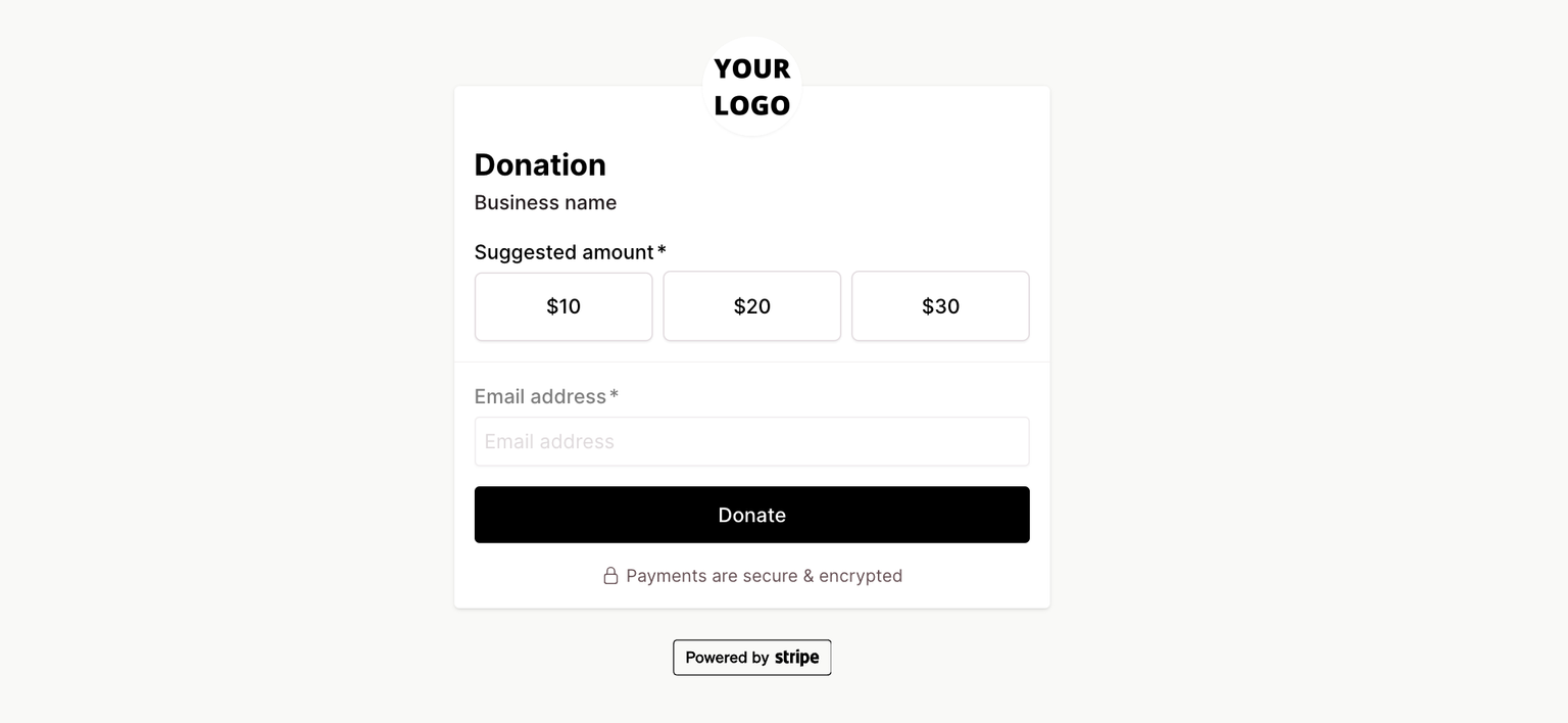
It is best for businesses looking to enhance user convenience and capitalize on spontaneous buying behavior. While this is the quickest way to checkout, the speed, and convenience may also lead to accidental purchases.
One-click checkout method is ideal for:
- Impulse purchases: Very minimal effort is required to make a purchase.
- Repeat customers: No extra steps are needed for users with stored payment information.
- Subscription models: Quick fix for renewing subscription-based services or products.
- Digital products: No physical address or delivery methods are necessary.
- Low-cost products or sales: When purchase is a “no-brainer”.
With Checkout Page, you can create a one-click checkout experience by embedding your checkout and taking payments with Apple Pay or Google Pay.
Multi-step checkouts
A multi-step checkout divides the purchase process into sequential stages, guiding customers through a series of pages. This type of checkout is effective when selling products or services that require a more thorough and informative purchasing process.
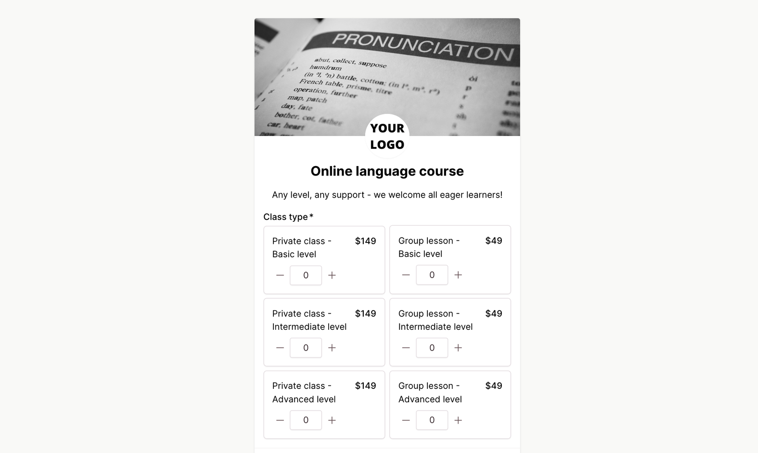
Make sure to test and analyze your user behavior to see if this method really enhances the overall shopping experience and conversion rates for your business.
While it may involve more steps, this method offers advantages in certain scenarios:
- Detailed purchases: Great for businesses with complex products that require more information.
- Collecting information: When additional details are needed for order customization or personalization.
- Cross-selling: Present additional products or offers during the checkout journey, like upsells.
- Building trust: A transparent step-by-step approach can build confidence in your customers.
- B2B transactions: Works for business-to-business transactions involving bulk orders or custom specifications.
Checkout Page makes it easy to create multi-step checkouts. This way, you can build a clear checkout flow to guide your customer through the experience in sequential steps.
Embedded checkouts
If you are looking for a checkout to perfectly suit your brand, this might be it. An embedded checkout seamlessly integrates the purchasing process within your website, keeping consistent with your brand.
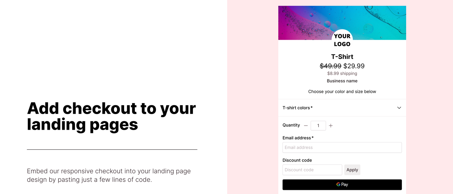
Embedded checkouts are great for providing a cohesive, distraction-free, and customized purchasing journey, contributing to a positive user experience and potentially improving conversion rates.
These are the key reasons for choosing embedded checkouts:
- Brand consistency: It feels just like your website.
- No distractions: Your customer stays on your page and finishes the checkout process without clicking away.
- In-app purchases: Ideal for mobile apps, enabling users to complete transactions while on the app.
- Streamlined user flow: Smooth transition from product selection to payment.
- Customizable interface: Match your layout and brand, and make it feel yours.
One of the key ways to share your checkout with your customers is through a Checkout Page embed. We have created a thorough guide for the most popular landing page apps to embed your checkout with ease.
Accordion checkouts
Accordion checkouts make the interface look user-friendly by organizing the purchase process into expandable sections resembling an accordion musical instrument.
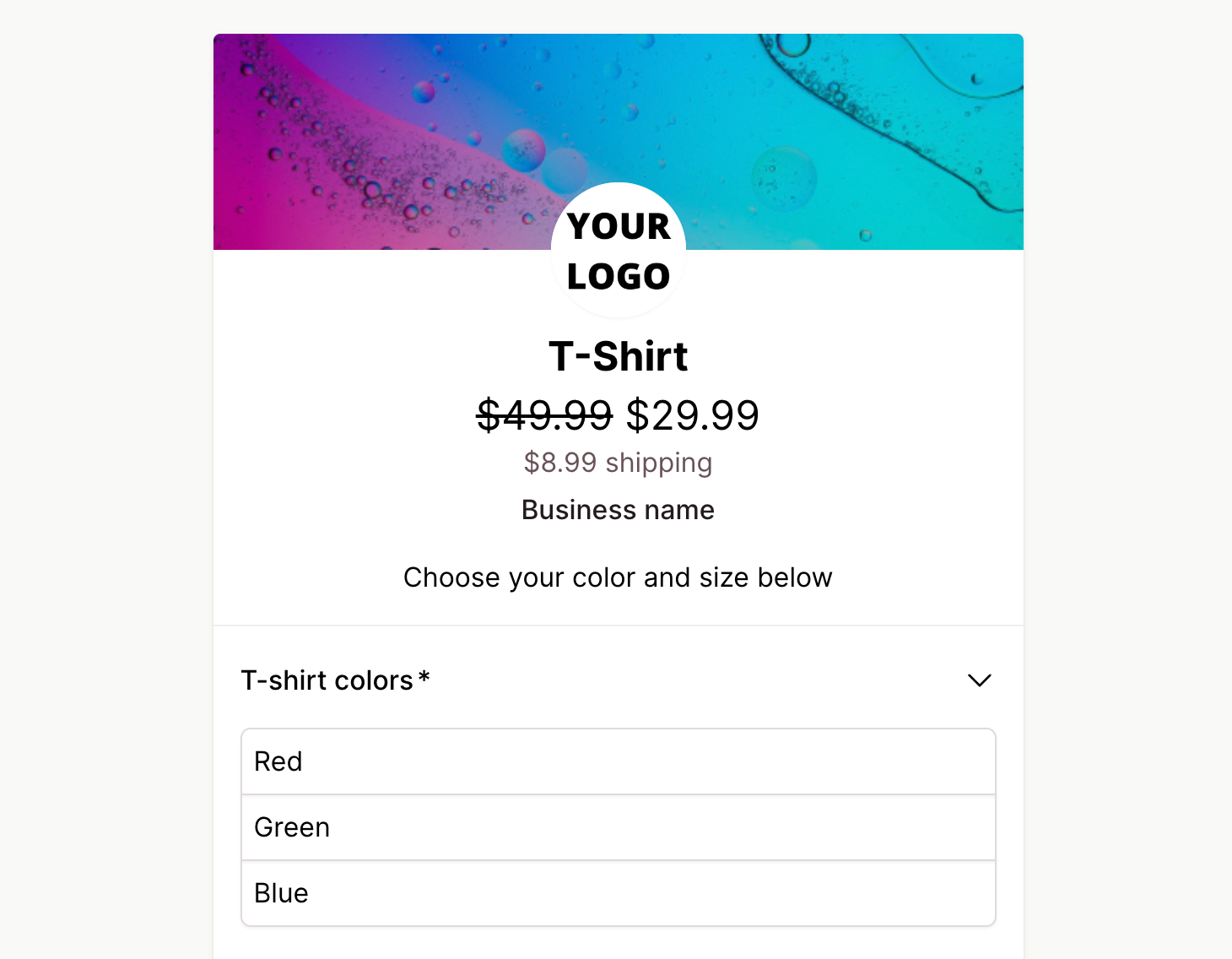
This type of checkout provides a nice balance between comprehensive information and a visually appealing, organized structure. The accordion format is great when you want to offer your customers choices but don’t want to make it look overwhelming.
Here are some great use cases:
- Progressive disclosure: Reveal the information slowly and step by step.
- User control: Allow customers to navigate at their own pace, expanding and collapsing sections as they wish.
- Mobile optimization: Offer a compact view for your mobile shoppers.
- Information segmentation: Ideal for categorization, as each section can focus on specific details.
- Visual appeal: Make your checkout interactive and visually engaging.
Checkout Page enables accordion-style variants to make your checkouts look clean while still collecting all necessary data. Our checkouts are fully customizable to find the perfect balance between the unique needs of your business and your customers.
Popup checkouts
Pop-up checkouts are a fun transaction experience by opening an overlay on the existing page. This type of checkout is great for businesses aiming to streamline the purchasing journey, highlight promotions, and engage users with a visually appealing and convenient transaction process.
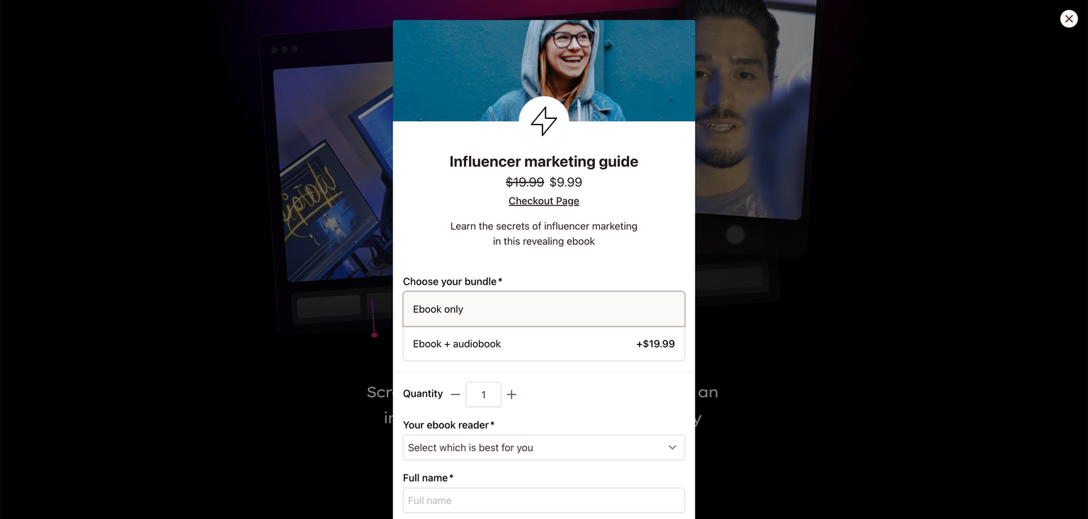
Testing and analyzing user preferences can help determine the effectiveness of your pop-up checkouts for your specific business context. However, they are particularly advantageous in the following scenarios:
- Minimized distractions: Keep the focus on the checkout and dim everything else on your page.
- Quick access: Immediate access to the checkout process without leaving the page.
- Promotion and offers: Perfect for displaying promotional messages or special offers in a visually impactful way.
- Enhanced user engagement: Create a dynamic and interactive transaction experience to capture your customers.
With Checkout Page, you can create a fun and interactive pop-up checkout and quickly add it to your site. We have built a list of thorough guides for the most popular website builders.
Checkout links
Checkout links are the most direct and efficient route to completing a purchase – simply share a dedicated link that leads users straight to your checkout page.
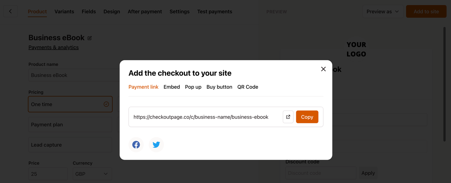
This type of checkout is a powerful tool for businesses like yours to enhance the efficiency of their sales funnel, especially in marketing campaigns, promotions, or time-sensitive events.
These are the best use cases for checkout links:
- Simple call-to-action: Skip the steps between product selection and payment.
- Marketing campaigns: Ideal for adding to email campaigns, social media posts, or digital marketing materials.
- Exclusive offers: Add a link to exclusive offers or limited-time promotions.
- Event sales: Effective for flash sales or event-specific promotions.
- Focused user flow: Drive targeted traffic directly to your checkout.
When you create your checkout on Checkout Page, we immediately create a link to your checkout for your customers. You can easily customize the URL (claim your free Checkout Page URL here), or design your link into a whole checkout page dedicated to your specific product.
QR code checkout
QR code checkouts offer a modern and contactless method for customers to initiate transactions by scanning a QR code with their mobile devices.
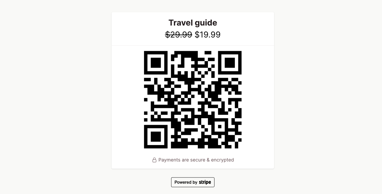
This type of checkout creates a versatile and efficient solution for businesses prioritizing contactless transactions and on-the-go purchases. Integrating QR codes strategically can enhance the overall customer experience and streamline the payment process in various settings.
QR code payments work best in these scenarios:
- Contactless payments: Offer a touch-free payment option, catering to customers who prioritize hygiene and convenience.
- Offline transactions: Great for in-store transactions, events and pop-ups where a traditional checkout setup may be impractical.
- Donations: Quick way to make a donation on the go or support your local street performers.
- Mobile-first: A camera is required to scan a QR code.
- Marketing integration: Integrate QR codes into marketing materials and posters.
Checkout Page automatically generates a QR code for every checkout and form page, making it super easy to accept payments using QR codes.
Guest checkout
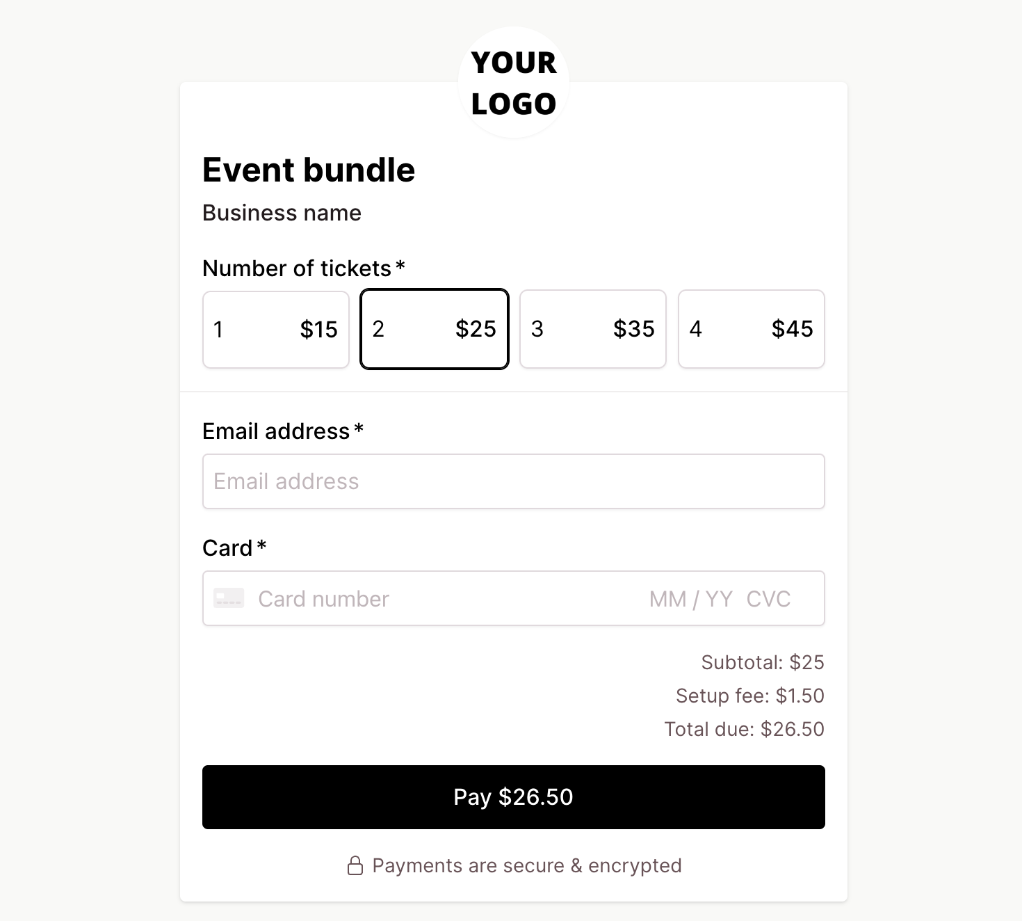
Make your checkout experience hassle-free without the need to create an account. Guest checkouts cater to a broad audience by prioritizing simplicity and convenience.
Enabling this type of checkout reduces the shopping cart abandonment rate and enhances the conversion rate. Do it strategically to contribute to a positive user experience and improved sales outcomes.
These are the best scenarios for offering a guest checkout:
- Reduced friction: Get rid of the barrier to entry by eliminating the mandatory account creation step.
- First-time customers: Ideal for attracting and retaining first-time customers who may prefer a quick, one-time transaction without committing to an account.
- Improved conversion rates: Minimize your cart abandonment and finish the purchase quickly.
- Niche products and services: If you are selling something that people don’t buy so often.
- Privacy concerns: Everyone is tired of the huge amount of spam and would prefer to avoid any unnecessary data submission, if possible.
Checkout Page is designed to offer the easiest, most straightforward customer experience. Our one-page checkouts are guest checkouts by default so no accounts are required to finish the purchase.
Conclusion
Crafting an effective checkout is key to driving customer conversion. Make a strategic decision when it comes to choosing the right checkout type for your product and business — from the speed of one-page checkouts that you can quickly create with Checkout Page to the simplicity of one-click transactions and the detailed guidance of multi-step processes.
This way, you can optimize the customer journey, elevate conversion rates, and ensure sustained success in the ever-evolving world of online shopping. Remember to choose the checkout that resonates with your product, streamlines the purchasing experience for your customers, and adjusts the design to match your brand.
For the next steps, check out our short guide on how to optimize your checkout and increase your conversion rates.
