You've spent time and money driving traffic to your online store, but people aren't buying as much as you'd hoped. For e-commerce success, attracting traffic and engagement is vital, yet ultimately, sales hinge on how many customers finish the checkout process.
When trying to increase sales, the checkout page might not be the first thing that entrepreneurs or marketers seek to improve. You might spend more time on your product pages or ads. But the checkout stage is where the deal is sealed, so making it work well is crucial.
In this article, you’ll learn about 20 ways and strategies to optimize the checkout with the intention of increasing conversion rates. Creating a good checkout experience will reduce checkout abandonment, nurture customer loyalty, and increase sales.
And no, checkout optimization isn’t only for bigger online stores—even small tweaks can increase your overall revenue!
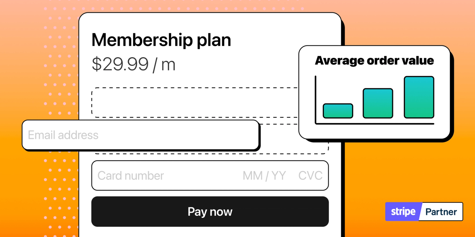
💡 Tip: Your checkout experience has a big impact on how much you sell
What is checkout optimization?
Checkout optimization is the process of improving the online checkout experience to increase sales. It includes simplifying the checkout, being transparent with pricing, and providing payment options. Enhancing the checkout process boosts conversions while lowering abandonment rates.
The goal is to remove any friction that could cause a customer to abandon their cart. Checkout optimization strategies typically focus on the user experience to nudge them towards completing their purchase.
Conversion optimization strategies include:
- simplifying the checkout design
- removing unnecessary steps
- making the process as straightforward as possible
When you optimize the checkout, you're making it easier and more efficient for customers to complete their purchases. Optimizing the checkout (or anything else) in e-commerce is an ongoing process, not a one-time activity. As new data becomes available, businesses need to continually test and make changes to maintain sales.
What makes a checkout experience good?
A good checkout page makes it easy for genuine shoppers to buy what they want from you. If your conversion rates are above 3.2%, you’re doing something right.
✅ Elements of a good checkout experience:
- Simple and seamless
- Easy to navigate and complete (i.e. fewer clicks)
- Transparent and clear (i.e. no hidden fees)
- Secure (e.g. SSL certificates)
- Meets buyers’ needs (i.e. multiple payment options, able to pay without an account)
❌ Symptoms of a poor checkout experience:
- Drives customers away (high checkout abandonment rate)
- Not meeting sales targets (low conversion rate)
- Frustrated customers (refund requests, complaints)
A complicated checkout will turn people away, costing you sales. But if it's easy to use, you're likely to see more people buying from you.
There is not one single perfect checkout process since multiple factors come into play: marketing strategy, product, service, brand, target customers, price, and more.
Checkout page vs checkout process
A checkout page and the checkout process are not the same thing. The checkout process includes the checkout page and other elements such as shopping cart reviews, payment verification, and order confirmation.
📄 Checkout page: This is typically a single webpage within an online store where customers can enter their shipping, billing, and payment information to complete a purchase.
📈 Checkout process: This covers all the steps a customer takes to finish buying something online. They'll move through various stages, including cart review, entering their info, payment, and the last confirmation.
💡 Tip: The checkout process is shorter for one-page or single-page checkouts. The thank-you or order confirmation page is also part of it!
The connection with conversion rates
Optimizing a checkout page and improving checkout conversion rates are closely related, but they focus on different aspects of the online shopping experience. Both are important for a successful online store, and they often overlap. The terms are sometimes used interchangeably.
Optimizing a checkout:
🛒 remove barriers that prevent shoppers from finishing their purchases
🛒 make it easy to checkout and pay
Improving checkout conversion rates:
📈 focus on tactics that encourage buying behavior
📈 get more people to complete a purchase
💡 Tip: The key determinant of sales and revenue is the number of shoppers who successfully complete the checkout process.
While the initial impression shoppers get from your call-to-actions and website design is important, the checkout page is ultimately the most critical element for conversion.
The methods discussed in this article have the same goal: to improve checkout performance and conversion rates.
Why do people abandon checkouts?
People abandon checkouts for a variety of reasons, some of which are caused by friction and difficulties while navigating or by a lack of trust in the checkout process.
Top reasons people abandon the checkout process:
🌬️ Unforeseen shipping costs or fees (47%)
🌬️ Need to create an account first (25%)
🌬️ Slow delivery or shipping estimates (24%)
🌬️ Worries over security or privacy (19%)
🌬️ A complex or long checkout process (18%)
🌬️ Can’t figure out the total cost in advance (17%)
🌬️ Technical issues or website crashes (14%)
🌬️ Lack of payment options (11%)
Source: Baymard Institute
💡 Those abandoned carts are more than just missed sales; they're wasted marketing dollars and lost opportunities to grow your customer base.
Conversion rates and checkout abandonment rates are closely linked. Both offer key insights into customer behavior in the final buying stages.
Some checkout abandonment is to be expected, as it is part of natural browsing and shopping behavior. Focusing on improving your customer's experience can increase the number of interested shoppers contributing to your bottom line.
Misconceptions about optimization
Many businesses believe that checkout optimization involves expensive tools or hiring specialists - but we’re here to debunk that.
💬 “We only sell a few products. There is nothing much to optimize”
💬 “We’re doing our best; people are just not buying enough”
💬 “Our website design is great. I think we need to spend more on marketing”
💬 “We need to work on getting more traffic before we optimize"
What we believe:
- Conversion rate optimization is crucial regardless of your traffic size.
- We argue that it is crucial for small businesses, especially those with limited advertising budgets, to maximize conversions from their existing traffic.
- There are no universal optimization techniques.
- In reality, what works for one store may not work for another.
- Tailor the checkout experience to your target customers’ needs and preferences.
- Checkout optimization can be as simple or complicated as you want.
- Even by removing steps and fields on the checkout page, you’re already making it easier for people to buy.
- It can also involve software and integrations but don’t attempt advanced techniques without first making simple, cost-effective changes.
- Optimizing anything is an iterative process.
- Be patient, A/B test one thing at a time, and make continuous adjustments to see sustained improvements. Your conversion rate will change for the better!
The impact of an optimized checkout on your revenue can be huge. It’s easy to overlook the checkout as it is the last step in the buyer’s journey. You want to ensure that the traffic you work hard to acquire has the best chance of converting into sales.
Easy ways to increase checkout conversion rates
Use these 10 strategies and tactics to optimize a checkout and improve conversion rates.
They cover business, design, and psychological aspects and aim to make the checkout process as simple and seamless as possible.
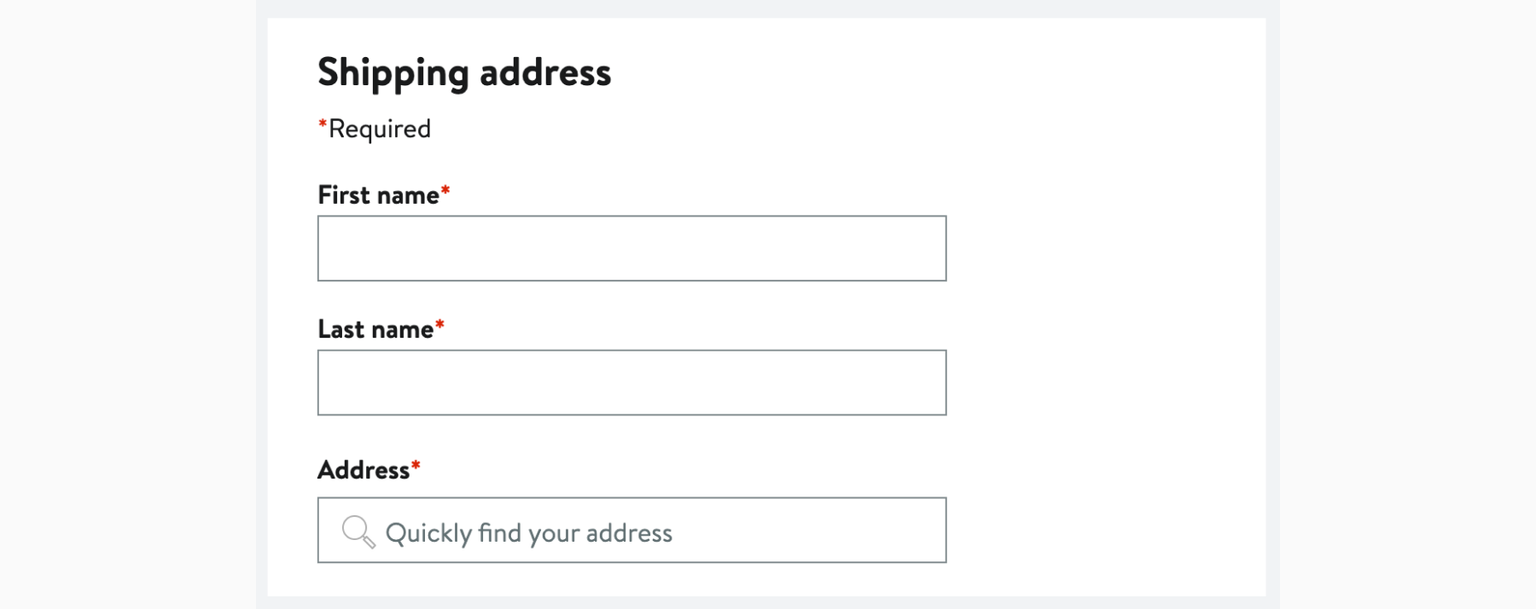
1. One page checkout
Using a single-page checkout, also known as a one-page or one-step checkout, streamlines the buying process. With fewer clicks and steps to complete a purchase, shoppers are less likely to get distracted or leave.
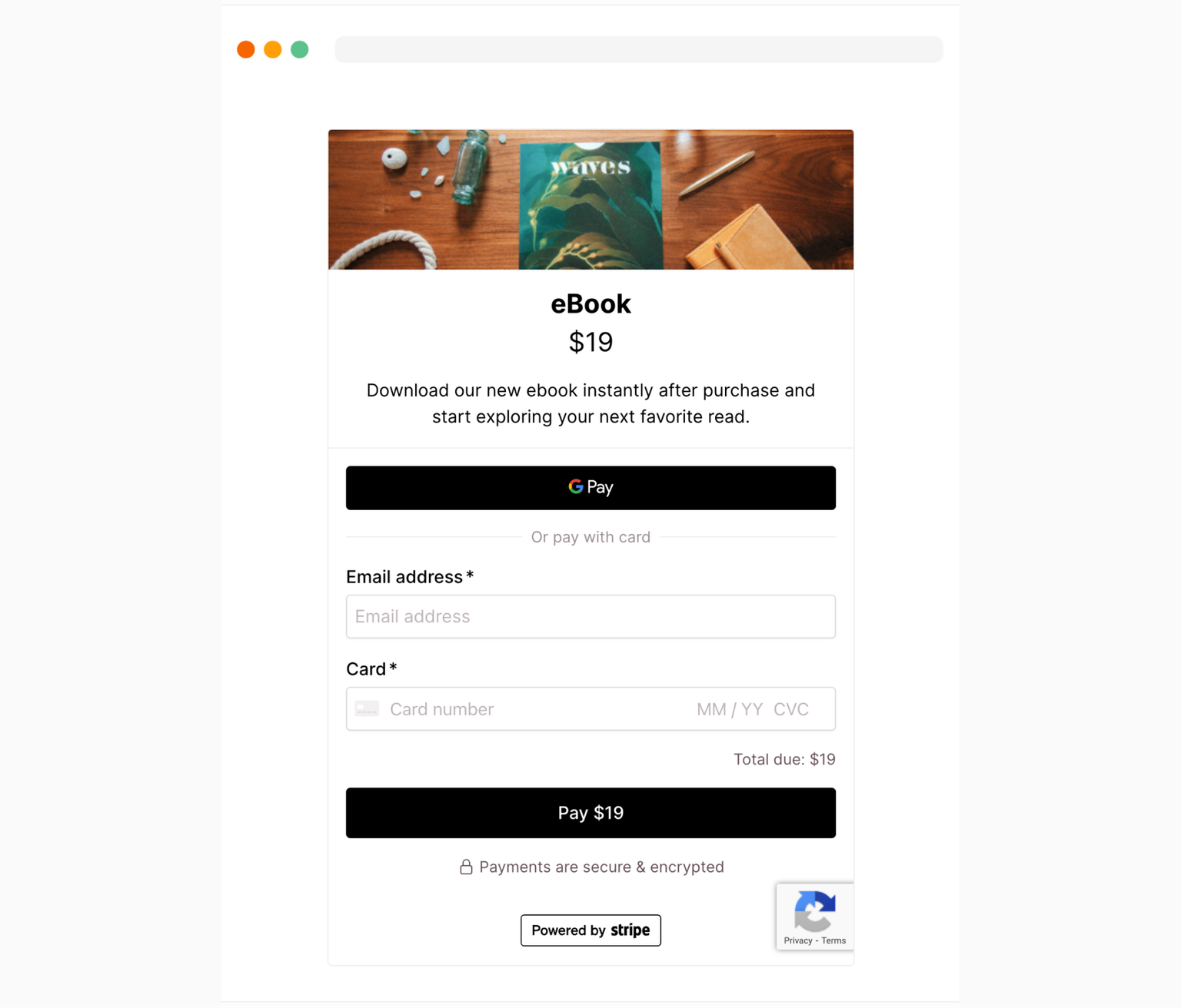
Example of a one page checkout.
- Fast to fill out
- Everything is laid out on one page
- Reduced abandonment
- More convenient for mobile shoppers
2. Remove unnecessary fields
Many checkout pages and forms can be simplified by reducing the number of required fields. To keep the checkout short and easier to complete, ask only for information relevant to the transaction.
- Digital products (e.g. e-books, online courses, reports, and subscriptions) do not require physical delivery, so asking for a shipping address only adds friction to the checkout
- Combining ‘Address line 1’ and ‘Address line 2’
- Leave out phone numbers unless absolutely necessary - not all customers want to provide this information
3. Display progress
For multi-step checkouts, showing a shopper their progress can help them know how much longer the checkout will take. Use visual cues like milestones, steps, or a progress bar to guide customers toward completing their purchases.
It helps provide shoppers with a sense of control and reduce anxiety, especially for longer checkouts.
4. Auto-fill features
Make checkout forms easy to fill out with autofill (or autocomplete). It’s not just convenient, it also saves time, avoids repetition, and reduces user error - one of the culprits behind abandoned checkouts.
For example, if you’re selling a physical product:
- Allow shoppers to select an option that uses the same address for both
- Address lookup tools that auto-populate fields based on the postal code or street name
Auto-populate the shopper's address with just the postal code.
5. Clear error messages
Clearly explain any errors that occur during checkout and how to fix them. It is best to immediately show users the error messages so they don’t get as frustrated when they can’t proceed to the next page.
- Use a different or bright color to make sure that they grab the user’s attention
- Explain what the error is and what they need to do (e.g. “enter the credit card number”)
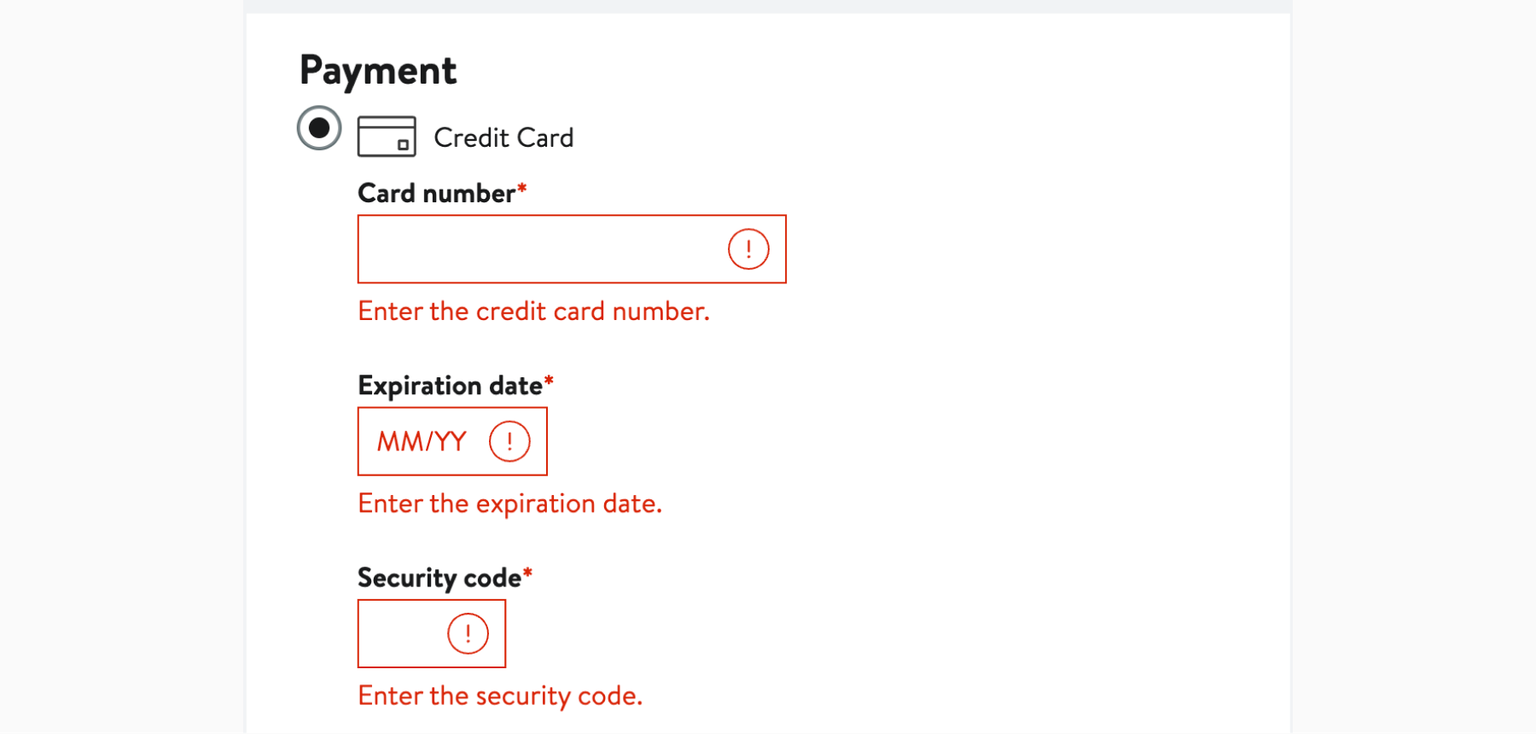
Error messages should give clear instructions on how to fix them (Nordstrom USA).
6. Trust symbols
Trust symbols (or badges) are not just decorative, they serve as powerful symbols that convey security and reliability to potential customers. A checkout that looks secure and professional can enhance your reputation and competitiveness, especially for businesses that sell internationally.
🏅 SSL certificate badges
🏅 PCI (payment card industry) compliance
🏅 Security certifications
🏅 Highlighting your returns policies
🏅 Money-back guarantees
By establishing credibility, you build trust and reassure hesitant buyers.
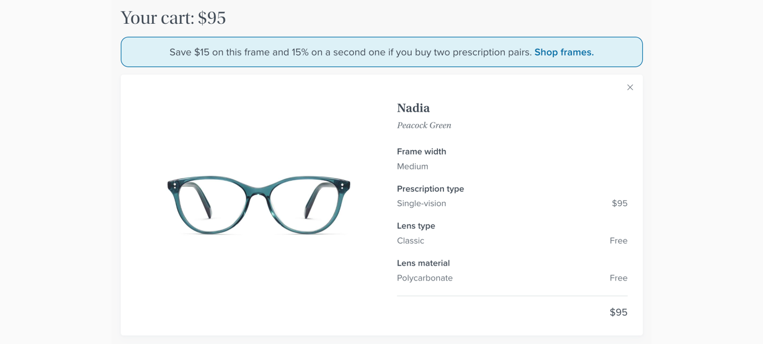
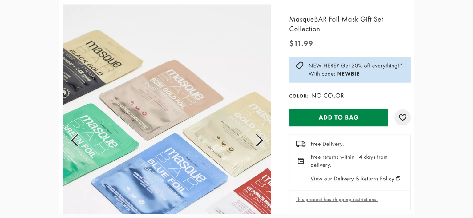
7. Payment options
Offering customers different ways to pay can help you increase sales. Add a selection of payment methods to meet consumer preferences and reach people worldwide. Customers like different ways to pay. Some use what they know best, and others use cards to earn points.
Besides choice, payment options have to be secure, too. Customers want the assurance that their personal information and sensitive data are properly handled.
Alternative payment methods to consider:
- Apple Pay, Google Pay
- Buy Now Pay Later (BNPL)
- ACH (automated clearing house) payments
- Bank transfers
- E-wallets, mobile wallets, or digital wallets
- Cryptocurrency
💡 Pro tip: Offering installments for big-ticket purchases can help with increasing conversion rates!
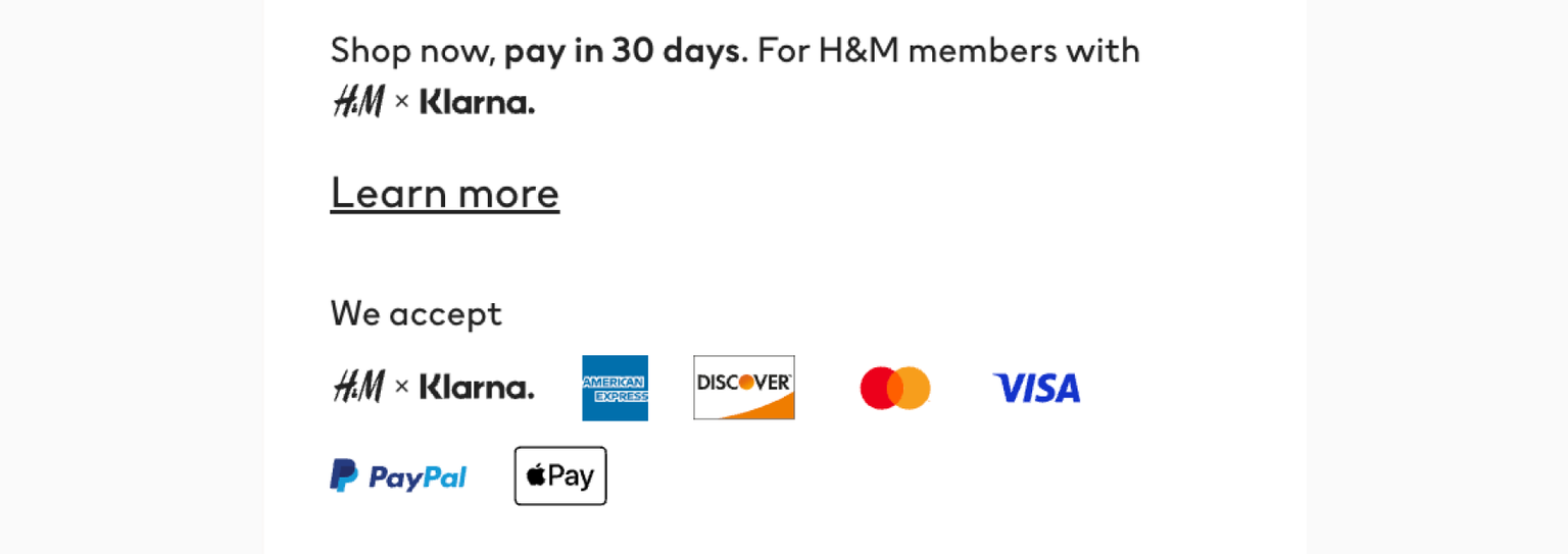
H&M accepts multiple payment methods.
8. Fee and cost transparency
Transparency is not just ethical; it's also good business. Clearly displaying the order summary upfront can prevent last-minute abandonment. The order total should be displayed once customers reach the checkout, not several pages or steps later.
A good cost summary should include:
- Item/product costs
- Shipping & handling fees
- Discounts
- Tax (estimated or actual)
- Any extra charges or fees
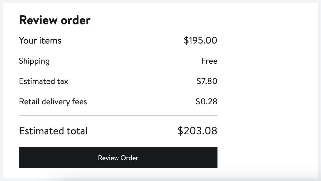
Clear order review that summarizes all costs (Nordstrom).
❌ Avoid the “drip pricing” strategy, in which customers only see the complete cost after navigating several checkout steps.
This can cause customer annoyance and feelings of deception, leading to abandoned checkouts and long-term damage to your brand's credibility.
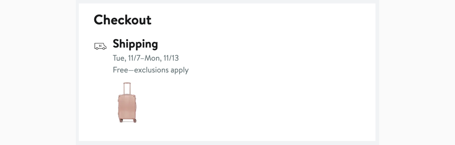
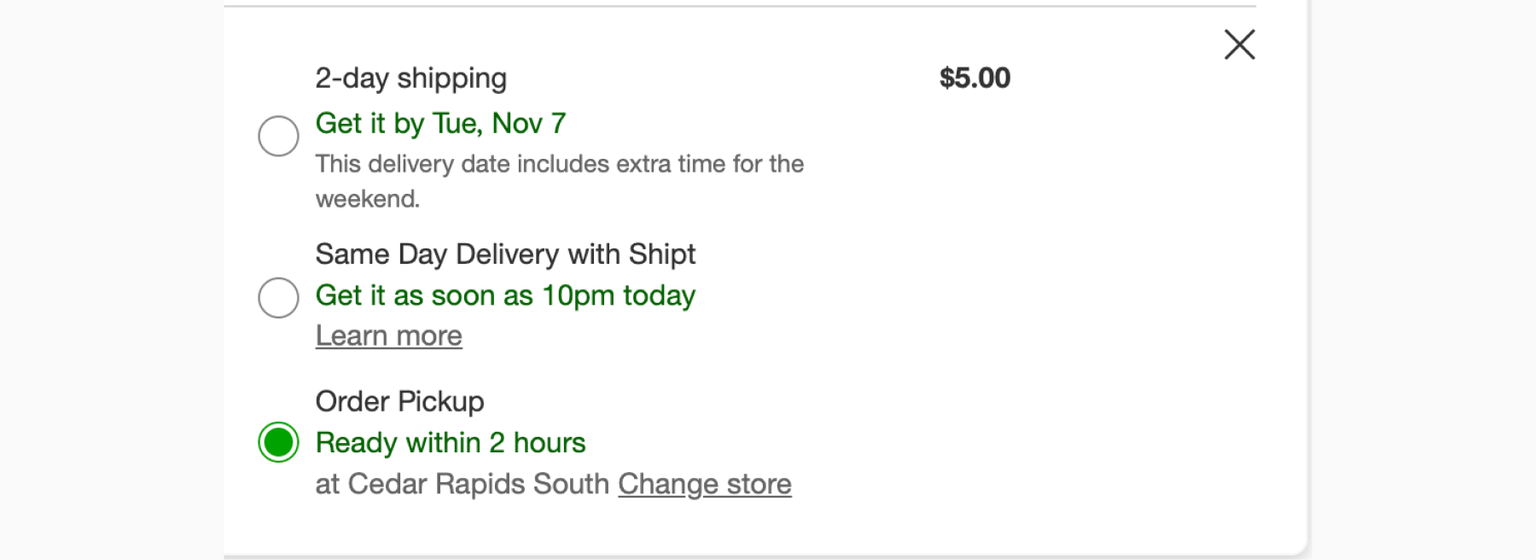
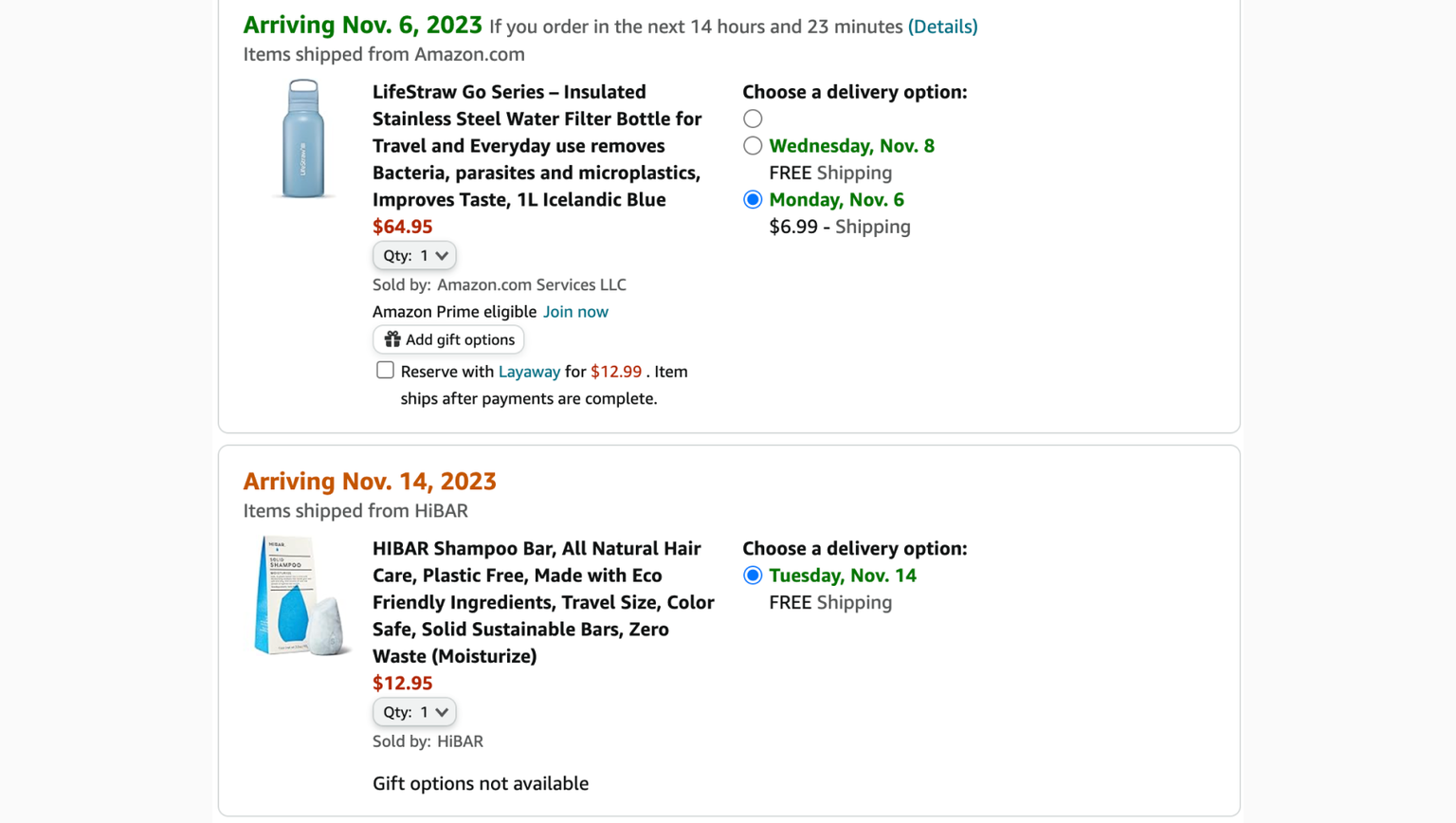
9. Shipping and delivery estimates
Providing a clear delivery date (or estimate) sets realistic expectations, eliminates guesswork, and lets customers plan for the arrival of their items.
Why it matters:
🗓️ Customers may need the item by a specific date
🗓️ They can arrange for someone to be around to receive the package
🗓️ Important for gifting, especially around holidays or special occasions
🗓️ Builds trust in the retailer’s service and commitment to customer satisfaction
Delivery dates can be a deal breaker. They might be comparing options with other stores and choose one based on how quickly they need the product.
Clear shipping estimate by Nordstrom ↓
Multiple shipping options from Target ↓
Different shipping dates (amazon.com) ↓
10. Mobile-friendly checkout
As more people browse and shop on phones, your store should be easy to use on these devices. This keeps you in the game, even if right now, most of your buyers prefer desktops. They could still switch to mobiles, especially when they're away from home.
There are some differences between similar-sounding terms. Ideally, your checkout should at least be mobile-friendly so that you don't lose out on a large segment of customers.
- Mobile-friendly checkout: Works on mobiles but isn't custom-made for them. Everything in the checkout functions, but it's not as tailored for a phone's screen.
- Mobile-responsive checkout: Changes shape to fit any screen, big or small. It rearranges itself so it looks good on desktops, tablets, and phones.
- Mobile-optimized checkout: This checkout is made just for mobile devices, with big buttons and easy forms. Users who visit your store from their smaller devices are shown a separate mobile-optimized version, which is crucial for online stores with a majority of mobile shoppers.
💡SEO tip: Google and other search engines favor mobile-optimized sites and checkouts!
Ways to make your checkout mobile-friendly:
📱 Simplified forms
📱 Minimize text input (use dropdowns or auto-fill whenever possible)
📱 Larger buttons and form fields
📱 Use a vertical (top-to-bottom) flow, rather than horizontal scrolling
📱 Avoid pop-ups
More strategies to improve checkout conversion rates
The following 9 strategies are more advanced and should be attempted after covering the basics mentioned above.
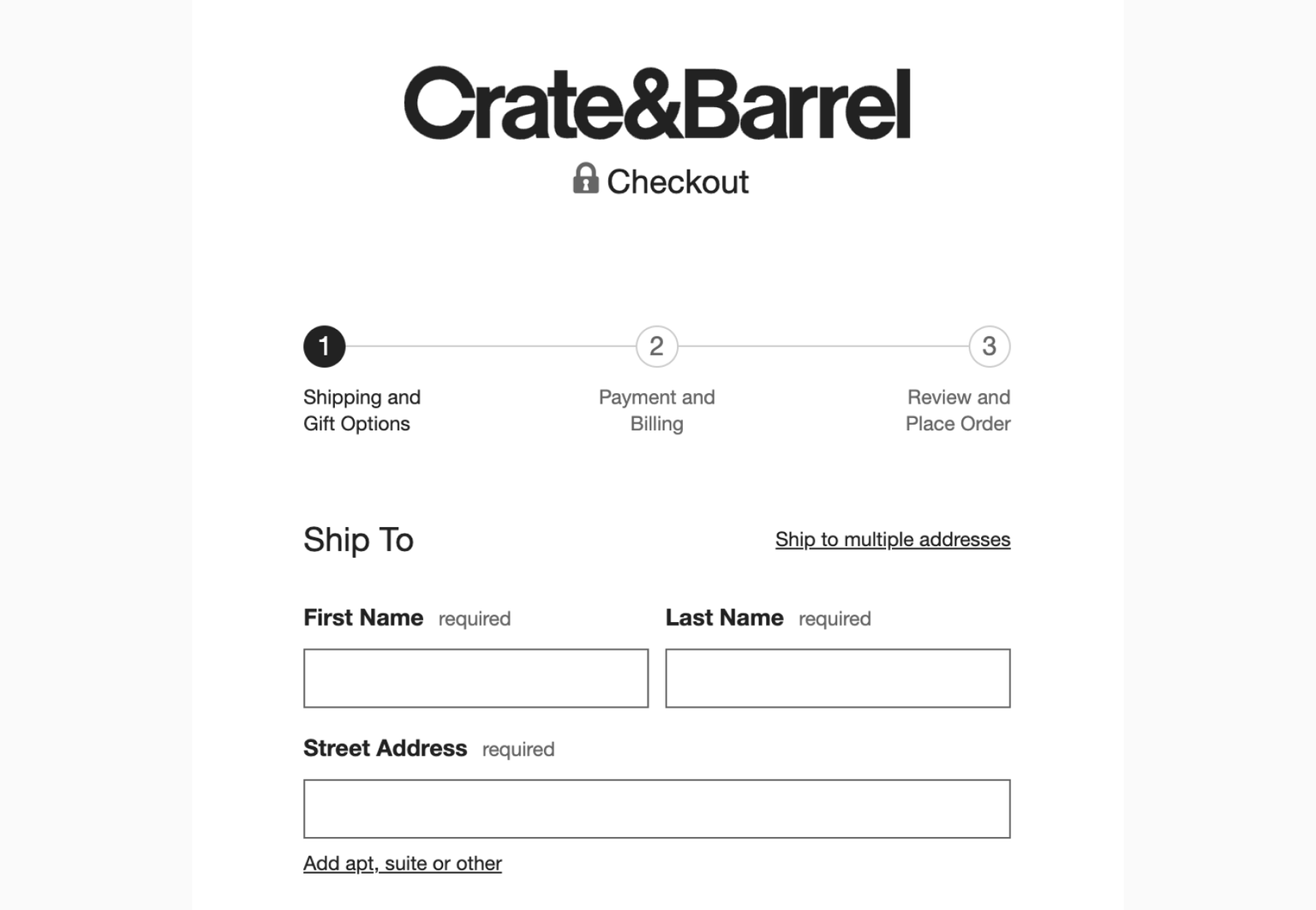
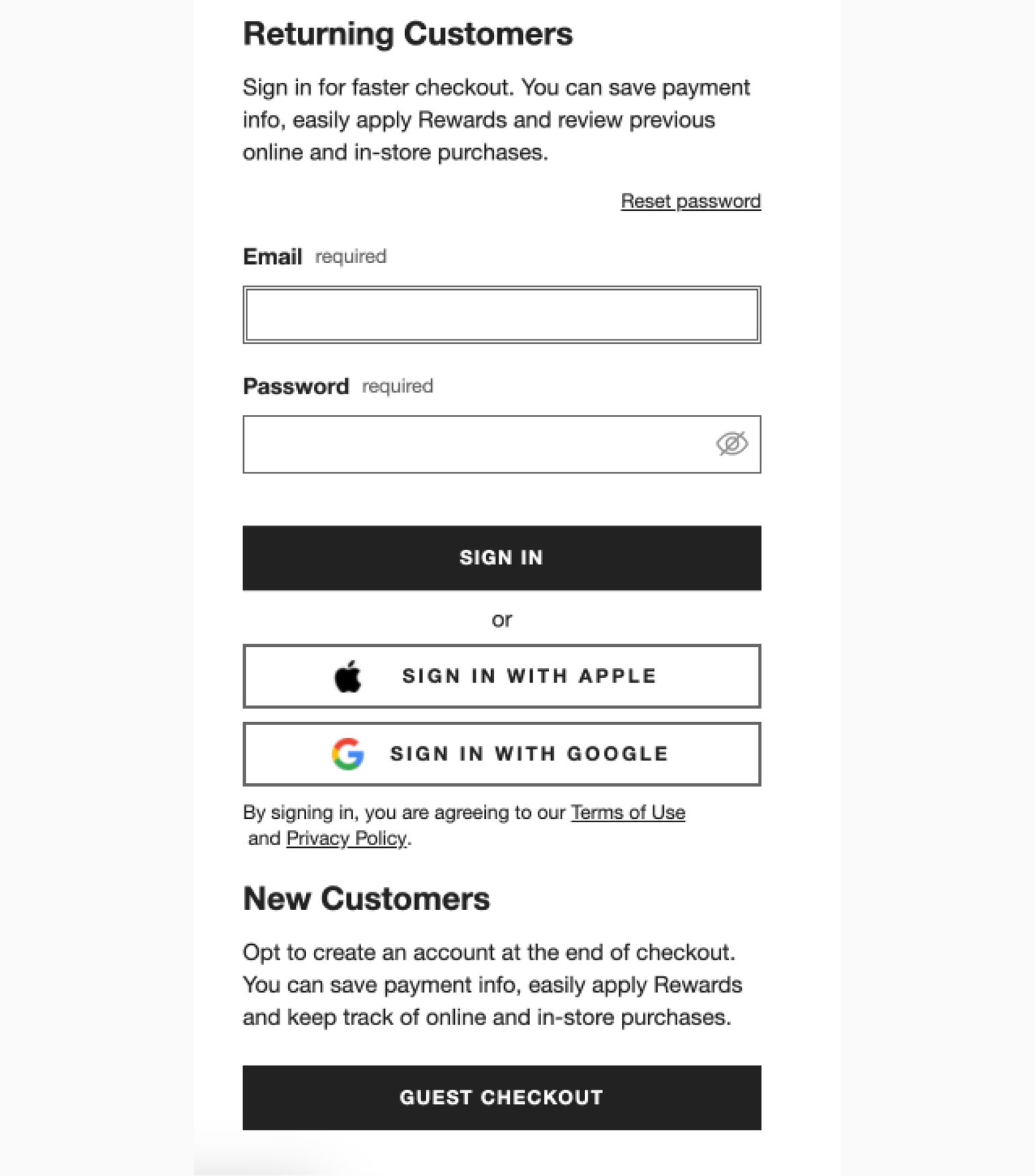
11. Allow guest checkout
Opinions on guest checkouts in ecommerce are varied, but here are some key perspectives: 25% of ready customers abandon the checkout because they can’t continue without an account (Baymard Institute).
Some don’t want to be forced to create an account for a one-time purchase or may be reluctant to share personal information. Others forget their login details and password and are turned off by the account recovery process.
Guest checkout option by Crate & Barrel.
👍🏼 Pros:
- Faster checkout process
- Increased conversion rates due to reduced friction and checkout abandonment.
- It's convenient for customers—quick and anonymous, especially for one-off purchases or when they’re in a hurry or on the go.
- A lower barrier to entry for first-time customers makes them more willing to complete a purchase without the commitment of creating an account first
👎🏼 Cons:
- Lost opportunities for engagement
- Customer service challenges when you don’t have their purchase history
- Reduced customer retention
There is a middle ground where businesses can offer guest checkout with the option to create an account after the purchase is complete. This approach combines convenience with the opportunity to engage customers over the long term.
Consider gathering customer emails right from the start by offering a special deal. This way, you secure at least one piece of valuable customer information early in the process.
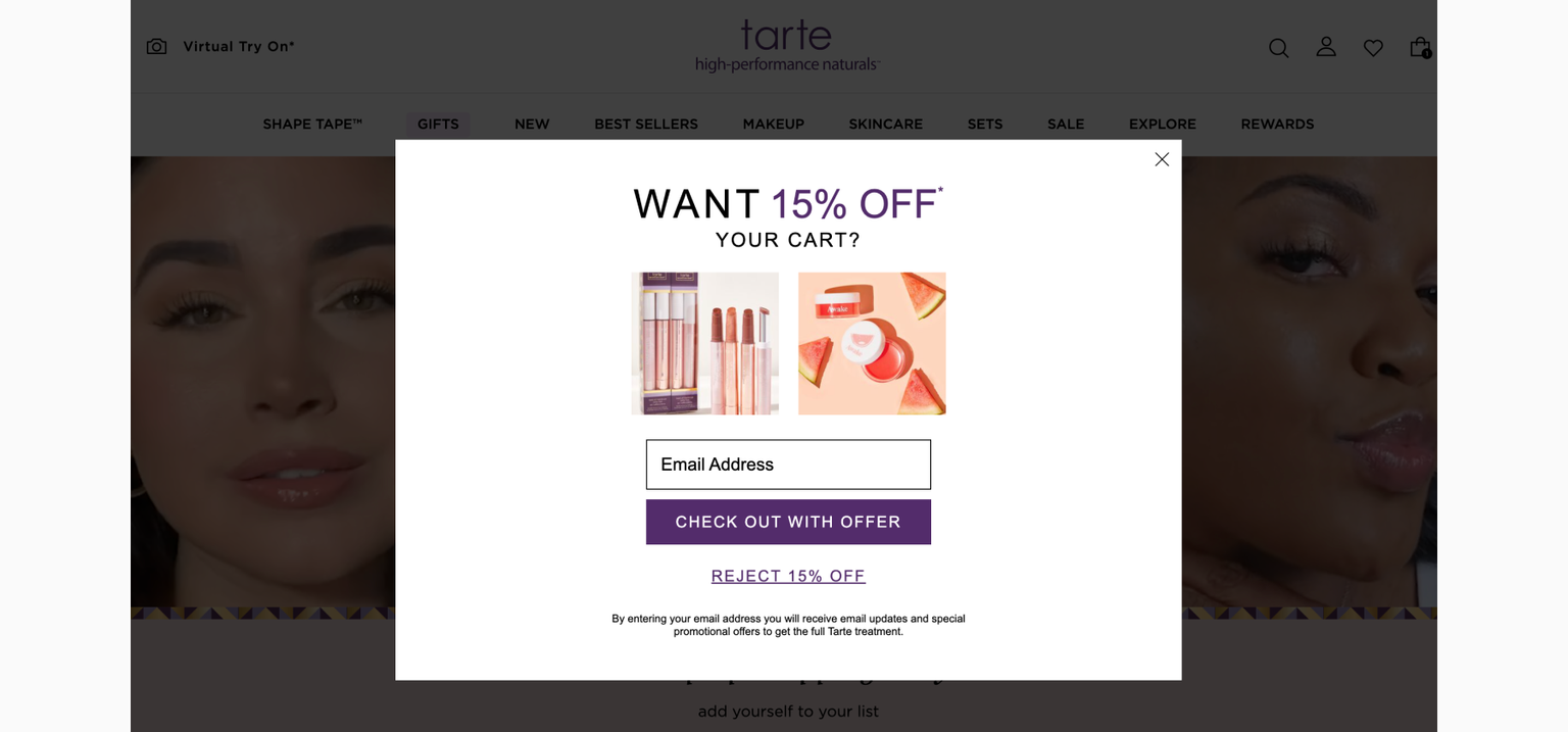
Email capture discount popup by Tarte Cosmetics.
12. Social proof
The use of social proof in e-commerce helps increase checkout conversion rates by building trust and reducing purchase anxiety. Seeing that a product is popular or highly rated can motivate customers to complete a purchase they might be hesitant about.
⭐ Customer reviews and ratings
⭐ Real-time stats (e.g. number sold, how many people are also viewing)
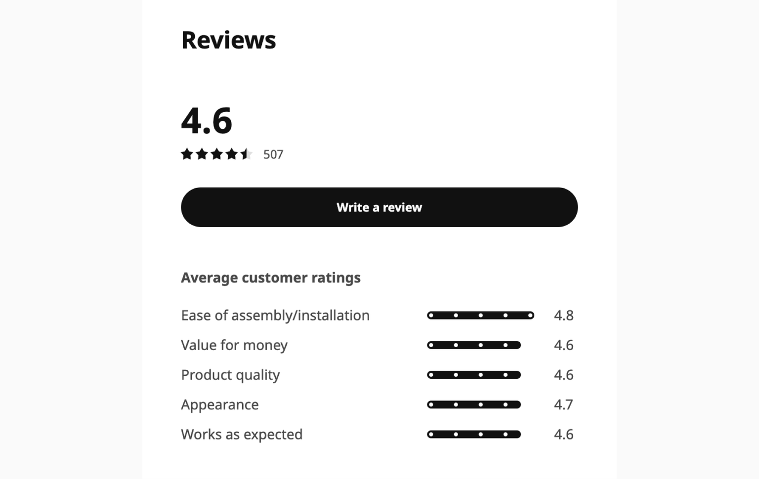
Customer reviews on an Ikea.com product.
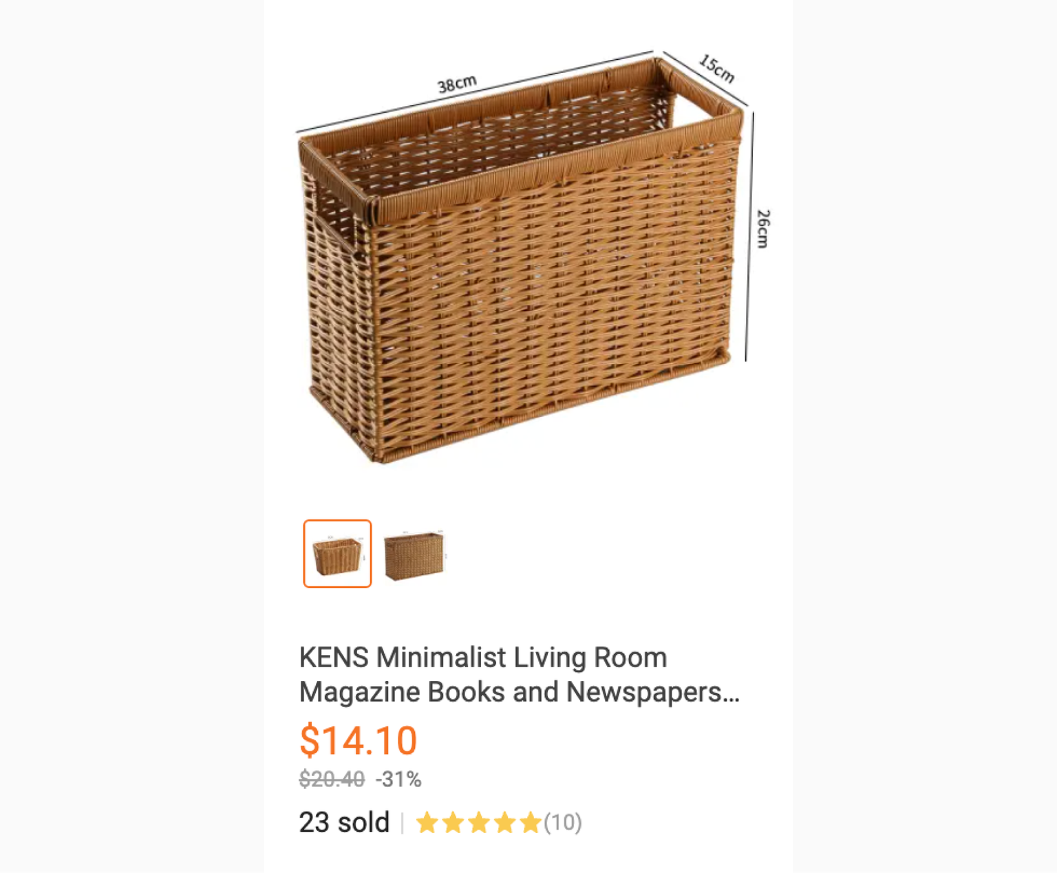
Number of items sold and ratings on Lazada.
Sometimes, all an indecisive customer needs is that final nudge at the checkout page. Knowing that others have made the same purchase can put customers at ease, especially new ones.
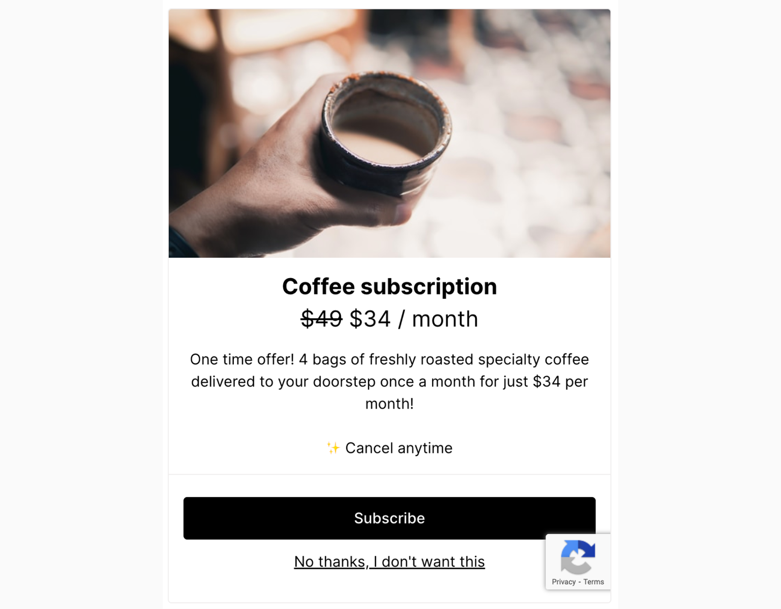
13. Upsells and cross-sells
Both of these and related products fall broadly under product recommendation mechanisms, and they aim to increase the average order value and overall revenue.
🔀 Cross-selling:
Encourage customers to buy related or complementary items. "People also bought" and "frequently bought together" are classic examples of cross-selling because they suggest items that go well with the customer's current selection or others' purchases.
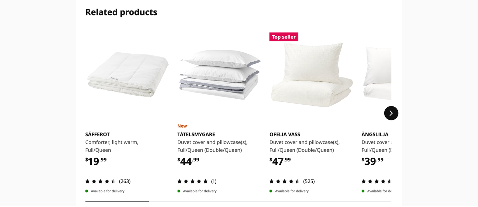
Ikea's product recommendations.
⬆️ Upselling:
Nudge customers towards purchasing a more expensive item or a higher-end version of the product they are looking at. Or tempt them to buy more at a discount.
Upsell at checkout (Warby Parker).
⬆️ One click upsell
A one-click upsell is when a customer gets a special offer after buying something. They can add this offer to their order with just one click, without re-entering payment details. It's a quick way to increase transaction/cart value and boost sales.
Choose from various one-click upsell templates by Checkout Page.
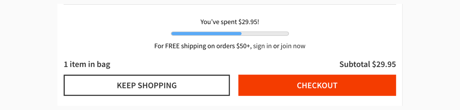
14. Free shipping or returns
High shipping costs are often cited as a primary reason for checkout abandonment. Offering free shipping can remove this obstacle for hesitant shoppers. It is a powerful psychological lever that can significantly influence buying behavior.
🚚 Attract customers who are still shopping around, making your store more appealing.
🚚 Added incentive to complete the purchase when they feel that they’re getting a better deal.
🚚 Shoppers often buy more to qualify for free shipping, increasing the average order value.
Free shipping progress bars encourage customers to increase their purchase amounts, as seen on gap.com:
Easy return policies with no strings attached make customers feel safe buying. They know they can send back things like clothes or shoes that don't fit without losing money.
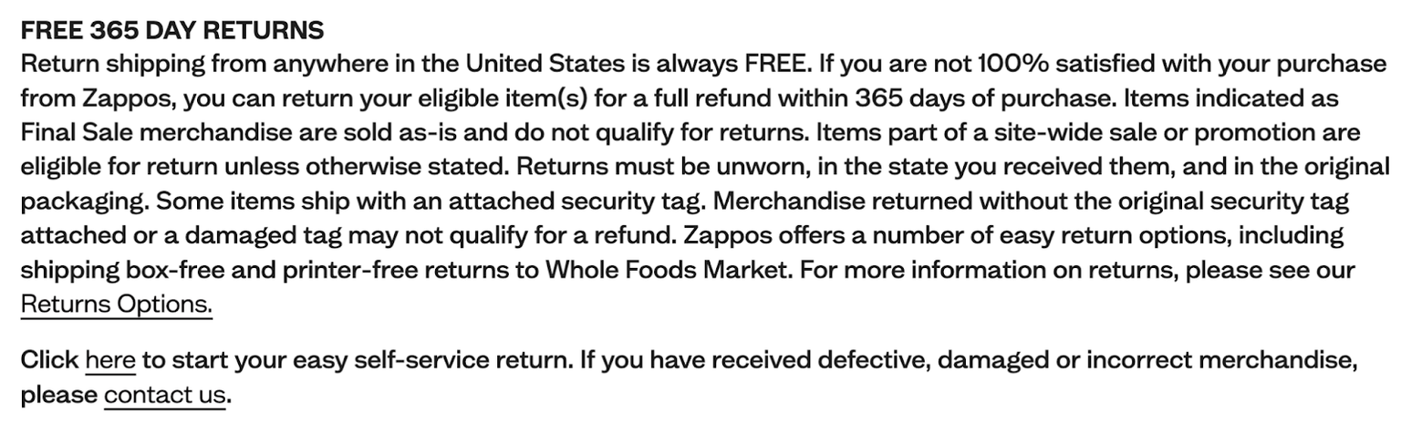
Zappos.com’s generous returns policy.
15. Make discount codes easy to find and apply
Discount and promo codes help attract customers and boost sales. At the cart or checkout page, they can make a store more appealing than competitors and motivate customers to buy.
Discount code for new shoppers as seen on asos.com.
On one hand, businesses do not want customers to come to expect discounts and hold off on their purchases until there’s a sale. Offering discounts can also eat into profit margins if managed poorly.
However, discount codes can be used to advertise current promotions and marketing campaigns and can be a marketer’s ally in boosting and maintaining conversions.
Ideas for discount codes:
💰 Display discount codes on a persistent banner at the top of each page
💰 Scatter them throughout your site or on landing pages
💰 Send codes through email marketing
💰 Leave codes on social media posts
💰 Show discount code at the checkout page
Sometimes, customers may arrive at the checkout ready to purchase but realize they don’t have a discount code. They might leave the page to find one, but this distraction might mean they don’t come back to complete the transaction.
The decision whether to display discount codes at checkout will depend on a business’s specific marketing strategy and goals.
16. Loyalty programs
Loyalty and reward programs are marketing strategies designed to encourage repeat purchases. By offering rewards, discounts, or other special incentives to frequent shoppers, loyalty programs encourage customers to return.
There are multiple types of customer loyalty programs, with the more common ones being cashback programs, tier programs, and points systems.
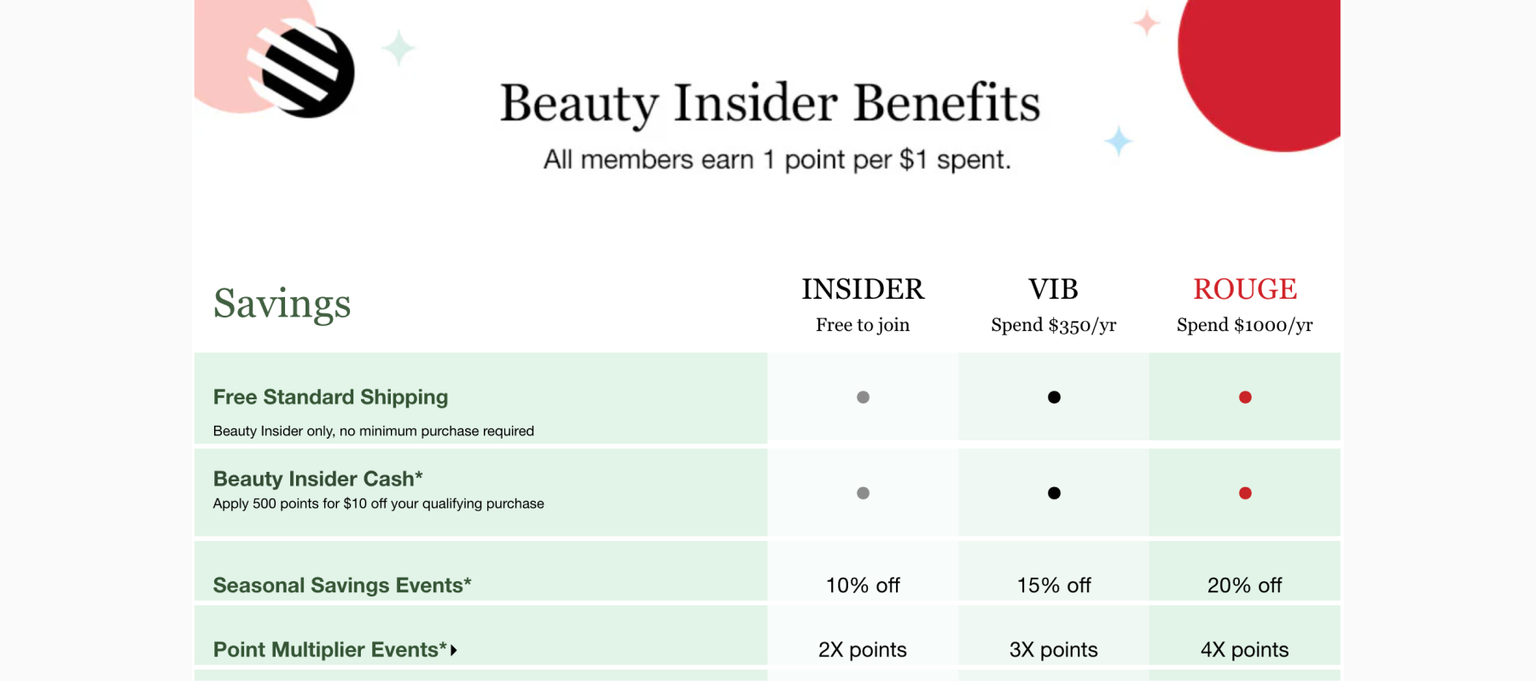
Sephora Beauty Insider program.
💡Tip: Customers in loyalty programs are likely to spend more over time, especially if there are multiple levels of rewards or statuses.
- Customer retention
- Enhances customer lifetime value
- Encourages repeat business
- Provides data for personalization
- Reduces price sensitivity
- Promotes word-of-mouth marketing
17. Recovery emails for abandoned checkout
Recovery emails are sent to customers who have added items to their shopping cart but left the site without completing the purchase. It acts like a safety net to capture sales that might otherwise be lost.
🕐 Timing is key. The first email should be sent within an hour of checkout abandonment while the purchase intent is still high.
Subsequent emails can be spaced out over a few days. Email marketing software can help with scheduling these email sequences.
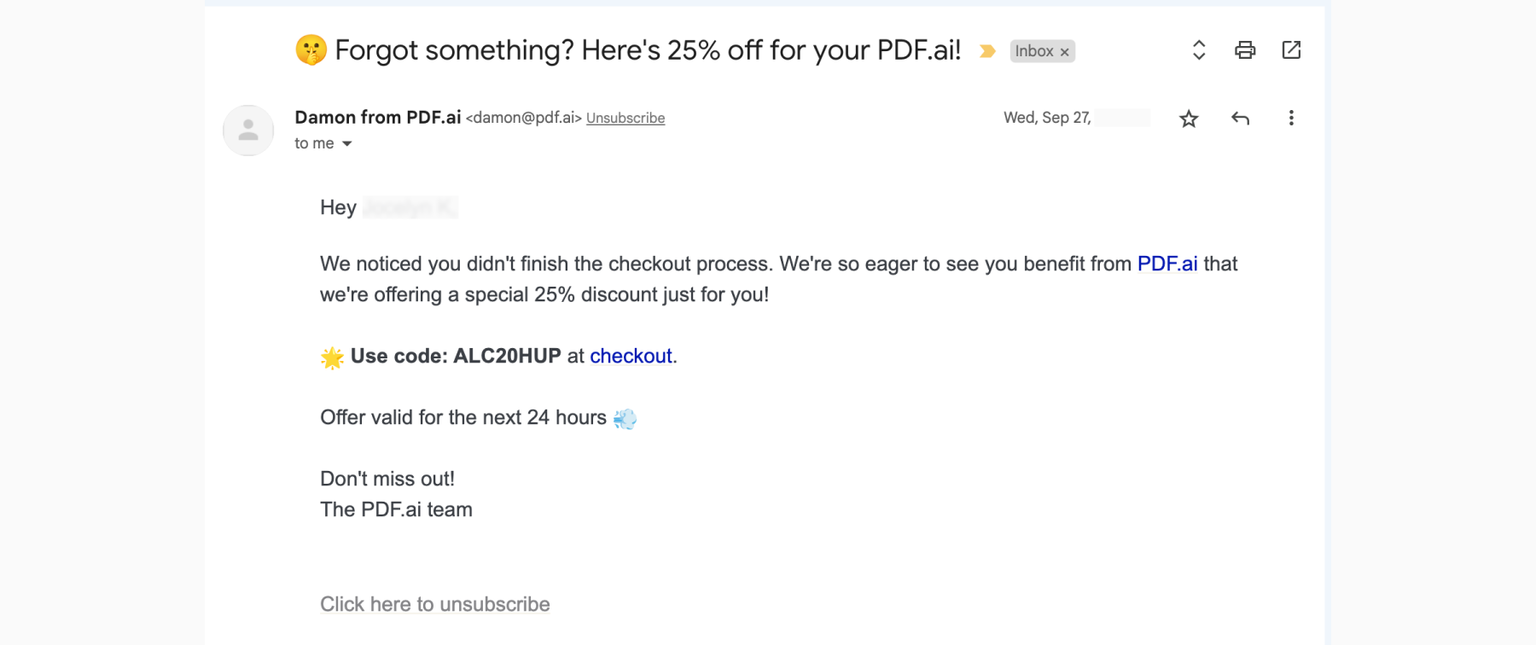
Example recovery email from PDF.ai.
In order to bring online shoppers back to complete their purchase:
✨ Personalize the emails based on what’s in their cart, their browsing and shopping history
✨ Incentives like a discount or free shipping can entice on-the-fence customers back
To craft recovery emails with a personal touch, ensure you have the customer's consent to reach out with marketing communications. Stay aligned with email marketing laws such as CAN-SPAM or GDPR to avoid any legal issues.
18. Retargeting campaigns
Retargeting in online checkouts works by tracking users who have visited your checkout page but left without completing a purchase. Google Ads are an example of retargeting. It nudges shoppers to return to your site and complete the checkout process.
🎯 How it works:
- Place the code: Add a retargeting code (or a ‘pixel’) to your checkout page.
- Track visitors: The code will keep track of people who start to check out but don't finish.
- Monitor for abandonment: If someone leaves without completing the purchase, the code remembers them (they get tagged for retargeting).
- Show ads later: As these visitors go to other websites, they see ads for the things they almost bought on your site.
- Track results: If they click the ad and buy something, you'll know it worked.
Before diving into retargeting ads, be mindful of customer privacy to stay compliant with privacy laws:
⚠️ Understand and comply with privacy laws (e.g. GDPR, CCPA, PIPEDA) where your customers reside.
⚠️ Ensure you have consent to track and retarget users. Allow people to opt out of retargeting ads.
⚠️ Implement CMPs (consent management platforms) to handle user preferences and consent records.
Following privacy laws helps you follow the rules and earn your customers' trust. When you're open about using their data and respecting their privacy, you build a better relationship with them.
19. A/B test different checkouts
What worked last month may not work tomorrow. Instead of guessing, A/B testing (or split testing) different checkouts will provide you with concrete data on customer behavior and preferences.
🧪 Identify areas for improvement
🧪 Make data-driven decisions
🧪 Continous testing is crucial for maintaining and improving conversion rates.
What you can A/B test in checkouts:
- Guest checkout option
- Button color and text
- Form field order
- Payment method display (icons, trust symbols)
- Segment your audience into groups
- Page layout
- Error messages
💡 Tip: Only test one variable per experiment so that you know which element makes a difference!
By experimenting with different elements, such as checkout flow, button placement, and payment options, you can identify the most effective design for your customers.
Create unlimited checkouts with Checkout Page.
Summary
In e-commerce, knowing your checkout conversion and abandonment rates is vital. They tell you how well your online shop is doing. Providing a good customer experience at checkout is good for business. Watch your checkout conversion rates to learn what's working and what you can improve.
An optimized and high-converting checkout should be:
📌 Simple – Provide a straightforward and smooth checkout process.
📌 Transparent – Clearly display shipping details, fees, taxes, and total costs upfront.
📌 Flexible – Allow guest checkout and offer a range of payment options.
📌 Secure – Use SSL certificates and other security measures to alleviate privacy concerns.
📌 Reliable – Functions smoothly without technical glitches or crashes.
Don't ignore your checkout and miss out on potential sales! Each abandoned cart represents a lost sale, wasted marketing efforts, and a potential dent in customer loyalty.
💡Tip: Stay proactive with your checkout optimization. Regular updates and enhancements are key to keeping it performing at its best!
FAQs
Are retargeting campaigns and recovery emails the same thing?
They are not the same but share similarities. While both strategies aim to re-engage users who showed interest in products, cart recovery emails have a more narrow and specific focus on users who abandoned their carts.
Retargeting campaigns have a broader scope. They target users based on various behaviors, not just checkout or cart abandonment. For instance, they might target users who visited a specific product page but didn't add anything to the cart.


