If you're an entrepreneur, business owner, or marketer, you know that converting visitors into customers is the lifeblood of your online business. But did you know that the final step—getting a customer to complete a purchase—can often be the most challenging?
Checkout conversions are not just a buzzword but a critical factor in your business's success. A well-optimized checkout process can mean the difference between a sale and an abandoned checkout.
Increasing your average conversion rate by just 1% could mean an extra few hundred or thousands of dollars in revenue and a higher ROI. In this guide, we'll explore checkout conversion rates, how they affect your business, and the practical steps you can take to boost your revenue.
#1: All about checkout conversion rates

What are checkout conversion rates?
The checkout conversion rate is the percentage of people who complete a purchase after starting the checkout process. In simple terms, it's a measure of how effective your checkout flow is at turning potential buyers into actual customers.
While often used alongside the term 'eCommerce conversion rate,' this guide zeroes in on the checkout page itself, not the overall store conversion.
💡Tip: It’s normal for most customers to take multiple visits (sessions) to decide and make a purchase.
Why is checkout conversion rate important?
The checkout conversion rate is arguably the most important eCommerce metric. Low conversion rates often indicate underlying issues that need to be addressed to improve performance.
Conversion rates can provide valuable data on what's working and what's not, helping you make informed business decisions:
- Direct impact on revenue: A higher conversion rate directly translates into more sales and more money for your business. Even a small increase can lead to significant gains.
- Cost efficiency: It's often more cost-effective to improve conversions from existing traffic than to attract new visitors. Optimizing the checkout can make the most of the traffic you already have.
- Competitiveness: A streamlined, user-friendly checkout can set you apart from competitors and make customers more likely to choose your business.
How to calculate the checkout conversion rate
Divide the total number of completed purchases by the number of initiated checkouts. Then, multiply it by 100 to get a percentage.

For example, if 100 people start the checkout process and 10 complete it, your checkout conversion rate is 10%.
What is a good e-commerce conversion rate?
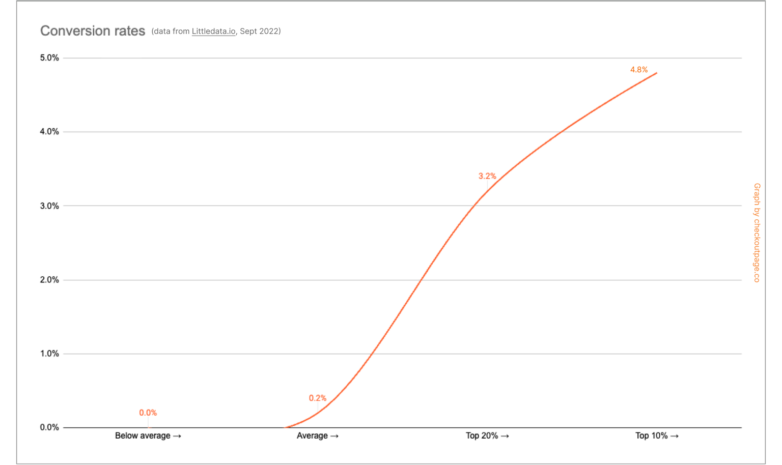
Data from a few recent studies places a good ecommerce conversion rate at above 3.2%. The Littledata study shows that most stores average between 0.2% to 3.2%. Anything above 4.8% puts you in the top 10% of performers.
Note: These are generic figures and do not consider the industry, type of product, advertising or marketing spend, and type of checkout.

Related article: 10 key e-commerce metrics you need to track
How to improve online conversions
Whether your goal is to optimize the checkout, or to gather data to refine marketing strategies, there are best practices that you can focus on for effective results.
“You can't improve what you don't measure.” – Peter Drucker
Multiple elements influence whether a customer completes a purchase. Here are some common factors that boost conversion:
✅ Good user experience
- Overall ease of use and navigation
- Fast page load time
- Mobile-friendliness
- Clear error messages
✅ Trust symbols
- Security badges (e.g. ‘Powered by Stripe’ badge)
- SSL certificates
✅ Payment options and transparency
- Multiple payment methods
- Upfront shipping costs, fees, and taxes
- Discounts and offers
- Clear CTAs (call-to-action)
✅ Convenience
- Guest checkout
- Fewer steps (e.g. one page checkout) and form fields
✅ Monitor and analyze data
- Add tracking (e.g. Google Analytics, heatmaps, event tracking)
- A/B test different checkouts
- Survey your customers
💡Tip: The less hassle in the checkout procedure, the more likely you'll see conversions.
Related article: 19 ways to optimize your checkout and increase conversion rates
#2: The problem with checkout abandonment

Businesses spend a lot of resources and time to get shoppers to their sites, so once traffic starts to stream in, getting them to make the purchase is equally (or even more) crucial.
While some checkout abandonment is normal, a very high rate could indicate underlying issues. Tackling checkout abandonment can increase conversion rates, improve customer satisfaction, and, ultimately, boost sales.
What is checkout abandonment?
Checkout abandonment happens when a potential customer starts the checkout process but leaves without completing the purchase. It's a frustrating issue for many online businesses, as you've done the hard work of attracting a visitor and convincing them to buy, only to lose them at the last step.
⚠️ Checkout abandonment differs from cart abandonment, which occurs when customers add items to their shopping cart but don't begin the checkout process.
Checkout abandonment is not just an annoyance; it has a real impact on your bottom line. Every abandoned instance represents lost revenue.
How to calculate the checkout abandonment rate
To find the checkout abandonment rate as a percentage, take the number of initiated checkouts, subtract the completed purchases, divide by the number of initiated checkouts, and multiply by 100.

For example, if 100 people started the checkout process and only 10 completed a purchase, 90 others did not. Hence, the abandonment rate is 90%.
Why online shoppers abandon checkouts
A high abandonment rate often signals issues in your checkout process. There are many reasons why people abandon the checkout, some of which are part of natural online shopping behaviors:
- Just browsing online: window shopping or saving items for later.
- Getting information: testing coupon codes, checking the total cost, and comparing prices with competitors.
- Distracted: forgetting to check out, real-life distractions, closing the tab on the browser.
Top reasons for checkout abandonment
🌬️ Unexpected shipping costs or fees (47%)
🌬️ Requirement to create an account first (25%)
🌬️ Delivery estimates too slow (24%)
🌬️ Concerns about security or privacy (19%)
🌬️ A complicated or lengthy checkout process (18%)
🌬️ Unable to calculate total cost upfront (17%)
🌬️ Technical issues or website crashes (14%)
🌬️ Lack of payment options (11%)
Source: Baymard Institute

Tips to reduce checkout abandonment
As the reasons above show, customers demand transparency, privacy, and security. Understanding these reasons can help you take steps to address them. Lowering the checkout abandonment rate can potentially increase your revenue.
🛒 Be transparent about costs
- One of the top reasons for abandonment is unexpected and hidden extra costs. Be upfront about all fees, including shipping and taxes.
🛒 Easy checkout process
- Keep forms short and collect only essential information (e.g., do not ask for customer addresses for digital downloads).
- Aim for a user-friendly, single-page checkout.
- Keep promos and discount codes at easy access.
- Offer free shipping.
🛒 Allow guest checkout option
- Don't force online shoppers to create an account; it can slow things down or cause them to leave entirely.
- Just collecting their email is enough; you can follow up after a sale to help them create an account or register.
🛒 Multiple payment options
- Offer a variety of payment options to suit different customer needs.
- For example, Stripe enables credit or debit card payment, Google Pay, Apple Pay, etc.
🛒 Mobile-friendliness
- Most checkout abandonments come from mobile and tablet users.
- Ensure that your checkout is optimized for smaller devices.
🛒 Security features
- Use reputable payment processors such as Stripe that handle sensitive data securely.
- Display security badges and SSL certificates to build trust and assure customers.
Related article: 10 proven ways to prevent checkout abandonment
#3: Optimizing your checkout

The design of your checkout page plays a big role in whether a visitor completes a purchase or not. Even small mistakes in your checkout page design can lead to big losses in conversions.
A well-designed page can guide the user smoothly through the process, while a poorly designed one can confuse, stall, or frustrate them, leading to abandonment.
💡 Great checkout design can lead to higher average order value per transaction
Elements of a good checkout page
A good checkout page should have several of the following elements:
Clarity
- No hidden fees (show the total amount and all fees upfront)
- Transparent shipping costs
- Clear instructions, CTAs, and number of steps
- For multi-page or multi-step checkouts, show progress bars (e.g., "Step 1 of 3")
Assurance
- Multiple payment options are displayed clearly
- Trust signals, badges, and symbols
- Authenticate payment information promptly
Seamless experience
- Optimized for mobile devices and smaller screens
- Use a one-page checkout whenever possible
- Leave out unnecessary fields to keep forms short
- Minimize distractions
- Keep things relevant
Examples of some of these best practices in checkout pages
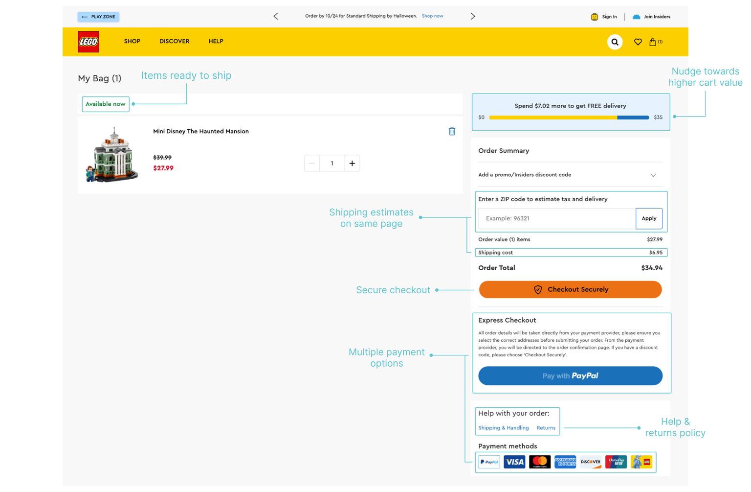
Lego checkout page:

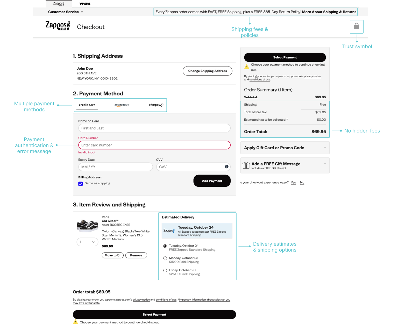
Zappos checkout page:

Checkout design best practices
Checkout design best practices are guidelines that help you create a streamlined and user-friendly checkout experience for your customers. The goal is to reduce friction and encourage them to complete their purchase without hesitation.
Here's a breakdown of best practices and strategies tailored for different business types and models.
E-commerce and online stores
- Guest checkout option: Always allow guest checkout! Forcing account creation is a major friction point that causes abandonment.
- Shipping cost transparency: Calculate and display shipping costs upfront. Surprise fees at the very end are a leading cause of cart abandonment.
- Multiple payment options: Offer major credit cards and popular digital wallets (PayPal, Apple Pay, etc.), and consider options like "Buy now, Pay Later".
- Saved shopping cart functionality: Allow shoppers to save their cart (via email or login) to reduce abandonment if they get interrupted.
- Cross-sells/upsells: Use subtle cross-sells ("People who bought this also like...") or upsells ("Upgrade to 2-day shipping") after the main purchase is committed.
Related article: Accept Buy Now, Pay Later with Checkout Page
Subscriptions (software, streaming services, memberships, etc.)
- Free trial emphasis: Clearly display trial length and terms. Streamline the trial signup to boost initial conversions.
- Pricing transparency: Present multiple plan options in a simple comparison table. Avoid hidden fees.
- Autofill: Use saved payment details or integration with services like Google Pay/Apple Pay to speed up repeat signups.
Related article: How to sell subscriptions and memberships with Checkout Page
Digital products (eBooks, courses, music)
- Simple downloads: Immediate access to the purchased product is crucial. Provide clear download or access instructions.
- Showcase value: Briefly restate what the user is getting and the benefits to reinforce the purchase decision
Resources:
How to sell digital products with Stripe and Checkout Page
Best digital products to sell in 2025
What is a digital product + 5 ideas for beginners (2025)
Event and retreat ticketing
- Seat selection: For events with assigned seating, have a clear, interactive map-based selection tool.
- Time pressure: Use a countdown timer if tickets are limited to create a sense of urgency.
- Bulk order options: If applicable, allow easy selection of multiple tickets to streamline group purchases.
Donations
- Impact focus: Use concrete examples to emphasize how the donation will be used.
- Suggested amounts: Provide pre-set donation amounts while still allowing custom input.
- Recurring donation option: Make it easy for users to set up recurring support if desired.
Resources:
How to accept donations with Stripe
Donation form templates [Checkout Page]
Summary
The checkout conversion rate measures how many visitors complete a purchase after starting the process. It's a vital metric for online businesses, as increasing it directly boosts revenue. This guide explored why conversion rates are important, how to calculate them, and the common reasons for checkout abandonment.
Optimizing your checkout design with a focus on clarity, seamlessness, and trust can significantly minimize abandonment and improve average order value (AOV). A good customer experience leads to happy customers, who then convert into repeat customers!


