If you're selling online, your checkout page is where the magic happens. Surprisingly, it's also the most neglected part of many e-commerce stores and websites. This article explains the importance of checkout pages in the checkout flow, the various types of checkouts with examples, and best practices for checkout page design.
What is a checkout page?
Checkout pages are the final step in online shopping, where customers provide payment and shipping information to complete a transaction.
This step is key in converting people browsing your site into actual buyers. It also plays a big role in shaping their shopping experience. Depending on the design, the checkout can be a fast, one-page task or a longer process with multiple steps. The checkout page usually ties in together with landing pages, sales funnels, product pages, and other parts of your checkout process.
Checkout page vs shopping cart
A checkout page isn’t exactly a shopping cart - they both serve different purposes and stages in the e-commerce process.
🛒 A shopping cart (or shopping bag) is like a virtual basket where customers can add and review items as they browse the site.
💳 The checkout page is where the transaction is finalized. Here, customers provide necessary information like shipping address, billing details, and payment method.
Clicking on the ‘checkout’ button leads users to the checkout page (Patagonia)
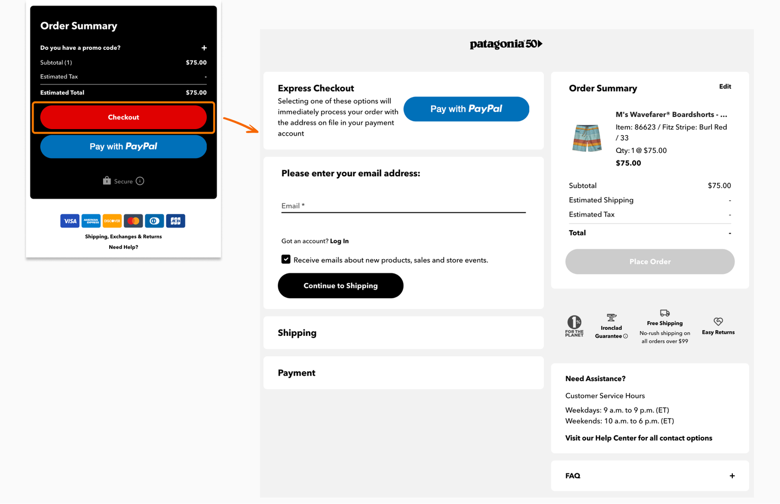
Main difference: The shopping cart is for gathering and reviewing items, while the checkout page is for payment and completion of the purchase.
How does a checkout page work?
The checkout page is where customers enter essential details like billing and shipping addresses. The store needs this information to finish the sale and get the shipping or fulfillment process underway.
These are the key actions for a shopper, which may be spread out over one or more pages:
- Input personal and payment information
- Choose shipping option (if applicable)
- Review the order
- Add discount or promo codes
- Complete the transaction
In one page checkouts or express checkouts, all these are done on one page, without redirecting shoppers across multiple pages.
Types of checkout pages
There are multiple types of checkout pages, with the most common ones being the one page checkout, multi-step checkout, and subscription checkout. Each of them is tailored to different shopping experiences and customer needs.
Multi-page checkouts used to be the norm for ecommerce, but the popularity of one-page checkouts has redefined customer expectations for a faster, more convenient online shopping experience.
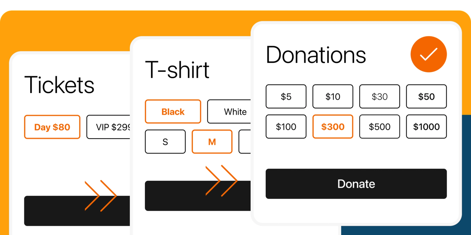
One page checkout
A one page checkout is a streamlined, online checkout process where customers can take all the necessary steps to complete a transaction on a single page.
Digital product one page checkout template by checkoutpage.co
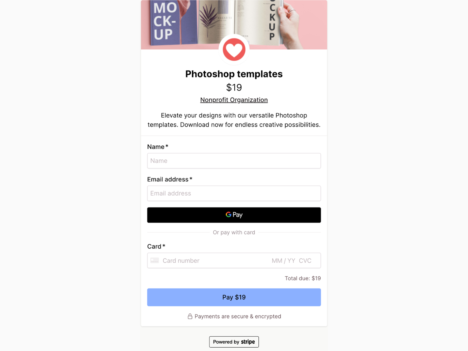
Also known as a one-step checkout or single-page checkout, this type of checkout is designed to make the final step of an online purchase as quick and effortless as possible.
One page checkouts are increasingly popular for a few good reasons:
- Reduced number of steps and clicks required from the customer
- Zero waits for multiple pages to load
- Faster transactions with less sources of friction
- Lowered abandonment rates
It is best for straightforward online purchases like digital products, digital downloads, courses, event tickets, and subscriptions, where home or shipping addresses aren’t required.
⚠️ Balancing design and a seamless user experience is essential - a long form on one page can add confusion and frustration to customers.
You might also see these other terms used interchangeably:
- Single step checkout
- Quick Checkout
- Express Checkout
- Instant Checkout
- “Buy now” button
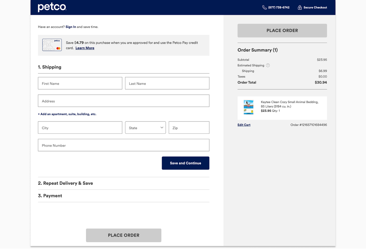
This is an example of using accordions (expandable sections) to guide shoppers through the steps on a single page:
Example of a one page checkout with accordions (Petco.com)
Multi-step checkout
A multi-step checkout provides a more detailed and guided checkout experience, better suited for complex or larger transactions. Customers have to navigate a few pages to get to payment, which gives businesses more data on customer behavior and analytics.
It provides a structured shopping experience (i.e. progress indicator and steps) but might deter customers who prefer quick and straightforward transactions.
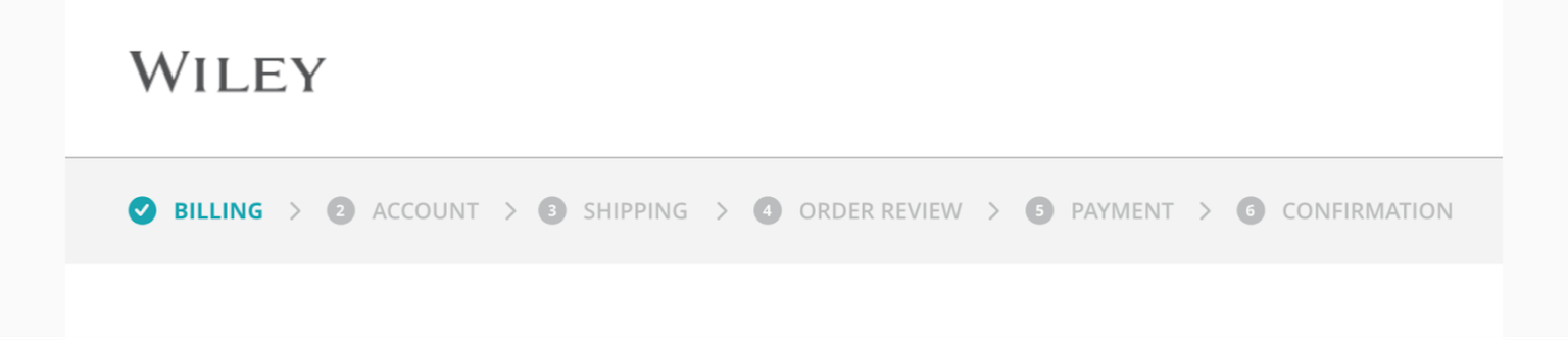
Progress indicator on a multi-step checkout (Wiley.com)
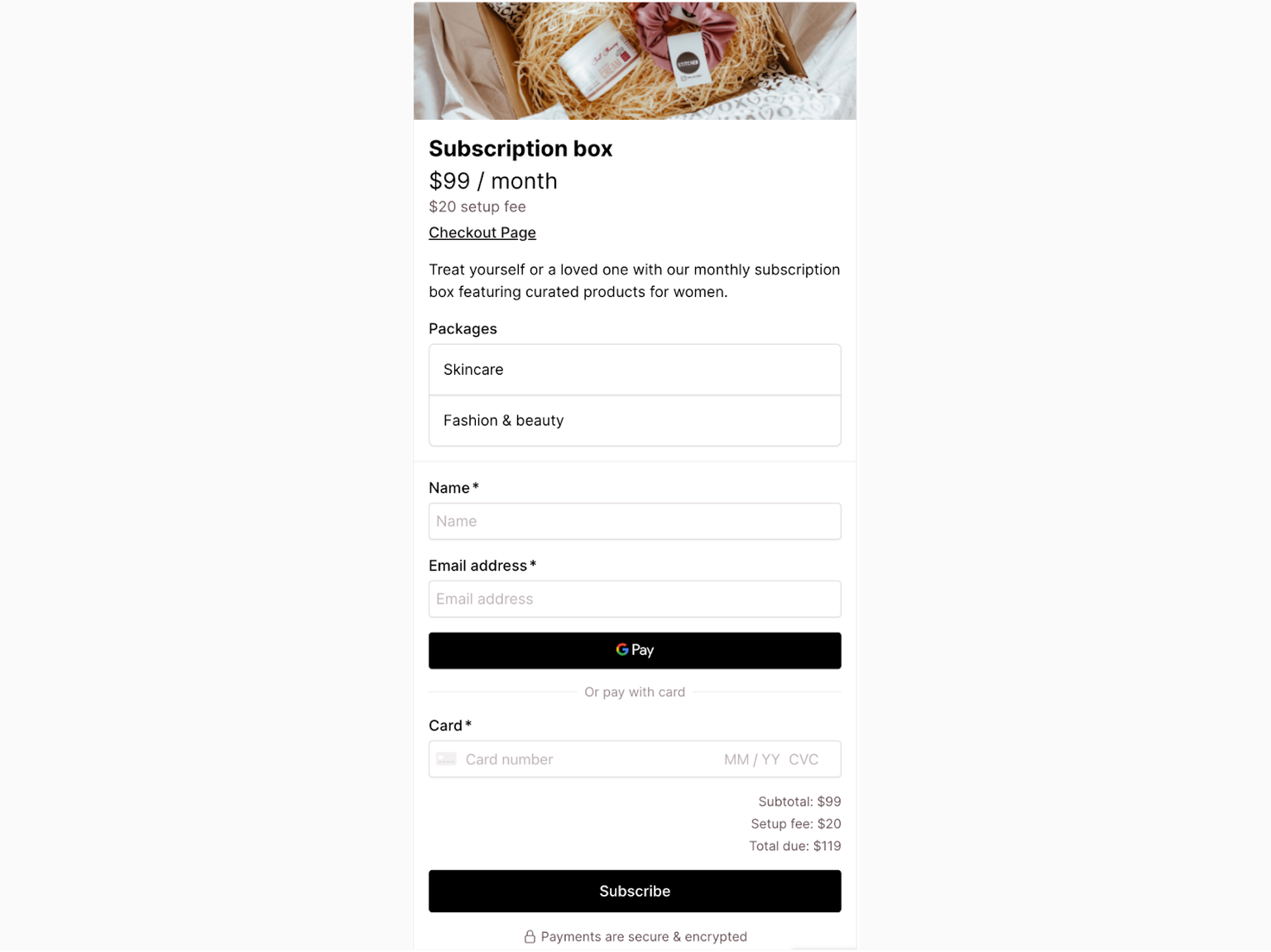
Subscription checkout
Subscription checkouts are a specific kind of checkout for recurring payments. This type of checkout sets up automatic payments for ongoing services or products. Businesses with subscription offerings, like monthly box services or online platforms, typically use this checkout type:
🗞️ SaaS (software-as-a-service)
🗞️ Access to digital content (online publications, streaming services)
🗞️ Monthly deliveries (e.g. subscription boxes)
🗞️ Memberships (e.g. communities, platforms, exclusive content)
🗞️ Online learning and courses
🗞️ Ongoing services
🗞️ Automated service renewals
Stripe subscription checkout template (checkoutpage.co)
💡 Set up recurring monthly payment billing or subscriptions with Stripe easily using Checkout Page - no coding required!
Checkout page examples
Checkout pages come in all shapes and sizes! What works for another industry or business may not work for others. Here are a few checkout examples and ideas, with a short analysis of how they could be optimized.
Example 1: Chewy
Chewy.com is an online retailer in the US that specializes in pet food and supplies. They offer a wide variety of products for different types of pets, with convenient delivery and subscription options.
What we like:
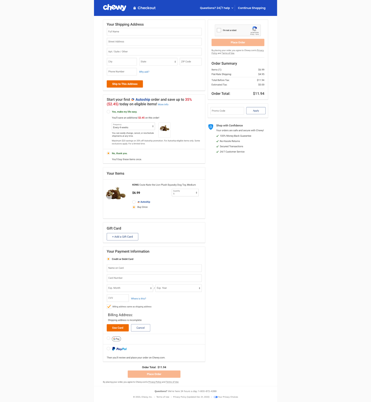
✅ Showing the product image makes it easy for customers to confirm their order
✅ They explain why they ask for your phone number
✅ All costs are shown on the one page checkout
✅ Option to select same billing and shipping address
✅ Timely error validation message, “Shipping address is incomplete”
What could be improved:
- The description of the ‘Autoship’ subscription could be more concise.
- There is too much information on one page, and it can get confusing.
- Lack of a guest checkout option.
Example 2: Wiley
Wiley.com is a global publishing company that specializes in academic publishing and instructional materials. They offer a wide range of products, including books, e-books, journals, and online courses, primarily in the fields of science, technology, and medicine.
What we like:
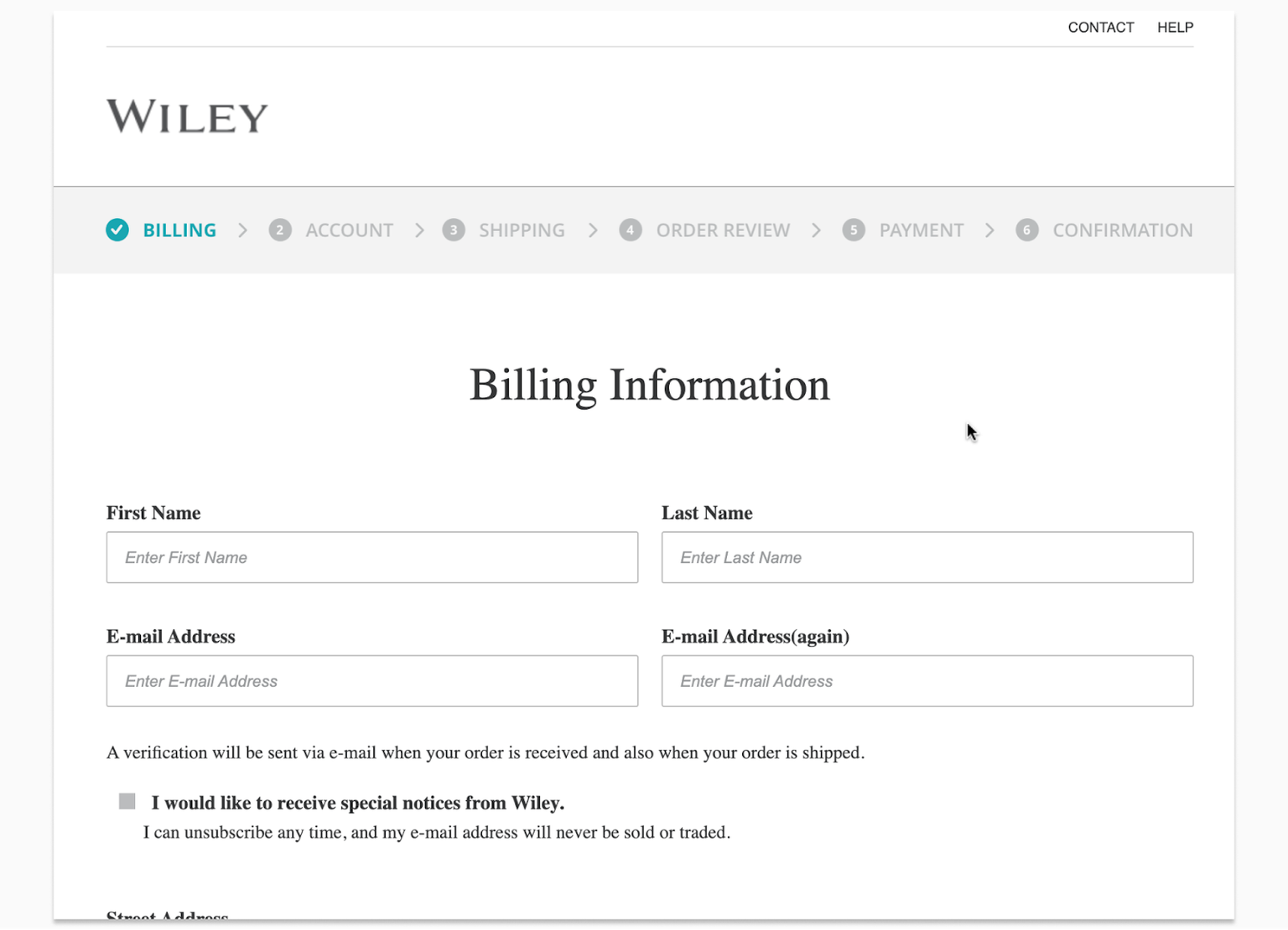
✅ Checkout progress indicator bar
✅ Removal of menu, navigation, and distractions
What could be improved:
- There are too many steps to checkout. It could be streamlined, especially for straightforward purchases like e-books.
- Mandatory account creation at the second step may cause users to abandon the checkout.
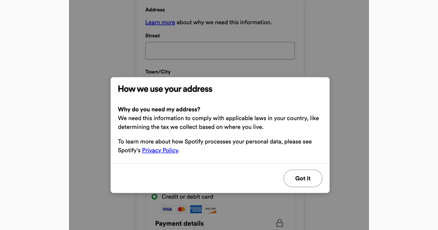
Example 3: Spotify
Spotify is a digital music streaming service with access to millions of songs, podcasts, and videos from artists all over the world. They offer a free, ad-supported version and a premium subscription model for ad-free listening and extra features like offline playback and improved sound quality.
What we like:
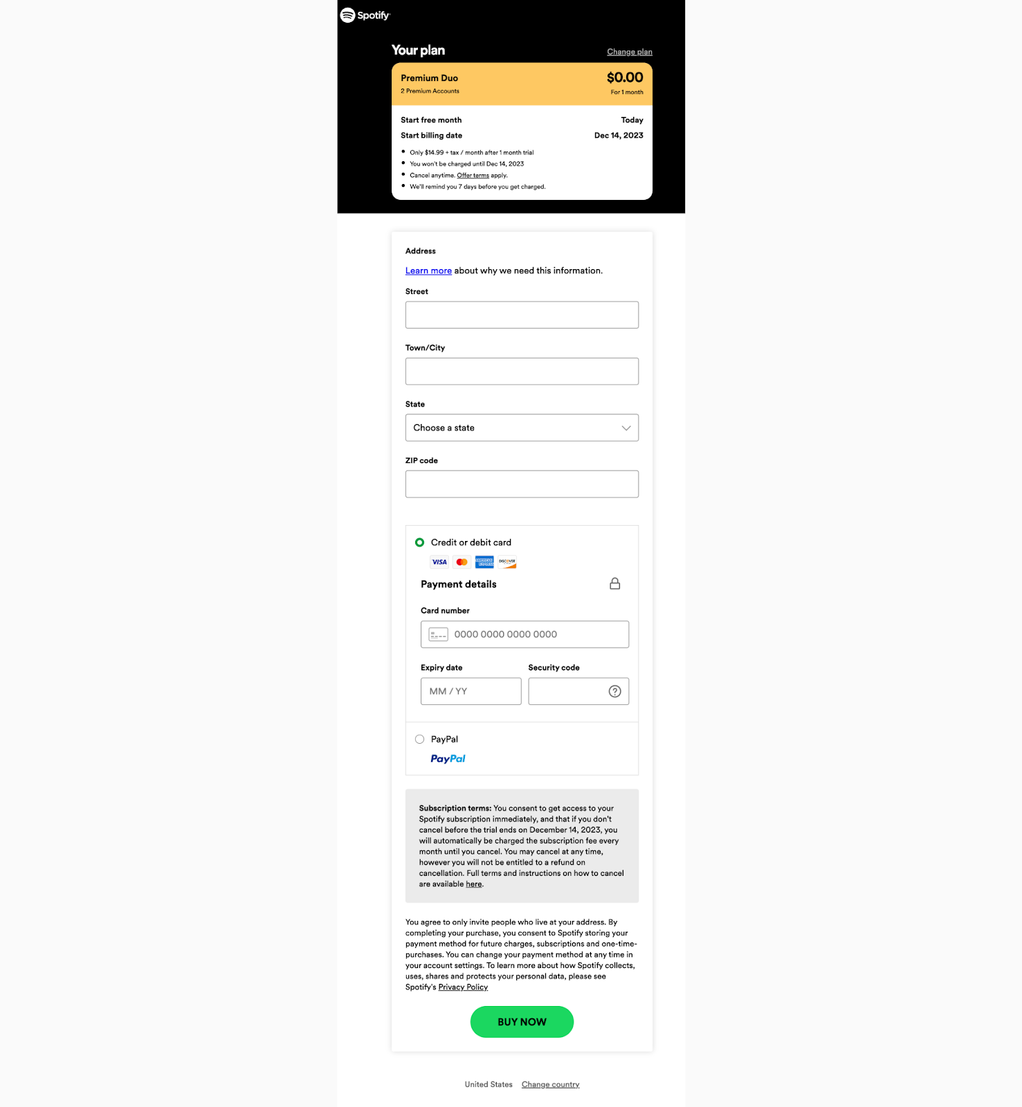
✅ No distractions✅ Short form with no unnecessary fields
✅ Clear call-to-action (‘Buy now’ in brand color)
✅ Explains why they need your address for an online music subscription
What could be improved:
- Help customers visualize when they will be billed next (instead of the lengthy disclaimer text).
Example 4: NY Sun
The New York Sun covers America and the world from a base in New York. It currently exists as an online-only publication and focuses on local news, culture, and politics.What we like:
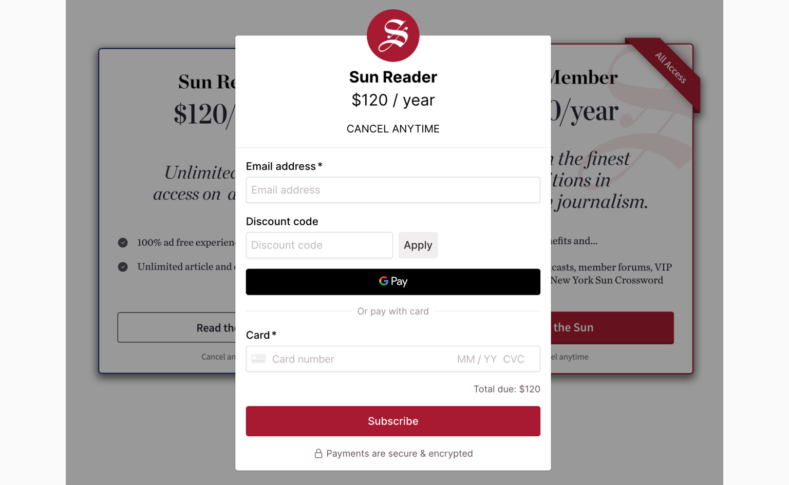
✅ Simple popup checkout
✅ Zero extra form fields to fill out
✅ Clear messaging and CTA
What could be improved:
- Perhaps more payment options (note: they might be optimizing it for their target audience).
💡 Learn more about checkout optimization and conversion rate optimization
Best practices for a successful checkout page design
In this section, we’ll discuss the best practices for designing your checkout page based on Checkout UX and abandonment rate research by Baymard Institute.
💡Do you know that poor checkout design and flow are often the sole cause for users abandoning the checkout process?
- Only collect necessary information: keeping the checkout form streamlined can get you those few extra sales each month - 18% of shoppers leave due to complicated or long checkouts. Leave out additional form fields at the checkout - your conversion rate will thank you for that!
- Minimize extra costs: show total costs early in the shopping process. Almost half of online shoppers abandon the checkout due to higher-than-expected additional costs (shipping costs, taxes, and fees). Some 17% of users abandon their carts because they cannot calculate the total order cost upfront, which they may try to do when deciding between retailers or online stores.
- Allow guest checkouts: 14% of desktop users abandon checkouts because there isn’t a guest checkout option (or they couldn’t find it), according to Baymard research. It's worse for people on mobile devices and smaller screens. There are many reasons why shoppers would want to make payment without first creating an account, and businesses could see this as an opportunity. UX research findings actually suggest that guest checkouts should be the most prominent option!
- Remove all distractions: removing navigation menus and ads on the checkout page(s) can minimize the chances of losing someone’s attention midway. Visual cues like steps or progress indicators can also help guide shoppers through checkout.
- Reduce anxiety with shipping: 24% abandon their cart/checkout if the delivery is too slow. Offering shipping options can be a crucial buying factor. Rather than saying that an order will arrive in “2 to 4 business days”, it’s easier for shoppers to understand exact dates or a date range, “Delivery between 21st to 24th December”. Online retailers can make the checkout even better by adding in an ‘order by this date’ cutoff to help shoppers understand when exactly they need to place an order!
- Clear return policies: for some businesses and products, return policies are essential. It’s best to communicate these clearly during checkout. Customer-friendly return policies can encourage more purchases!
- Secure payment handling: shoppers want to know that their credit card and sensitive payment details will be securely handled. Opt for reputable payment processors and gateways, and display any security certifications or badges to signal this to shoppers.
There isn't a single best way to design a checkout, but following these tips can make the checkout easy to use, increase conversions, and keep customers happy!
💡 Read more: ways to optimize your checkout and increase conversion rates
What you shouldn’t do on a payment page
There are also things you’ll want to avoid on a checkout page. For example:
- No surprises (except confetti, never avoid confetti). Tip: don’t add unexpected fees (‘drip pricing’) throughout the checkout process. Instead, show the total cost as early as possible.
- Force potential customers to create an account. Some customers don’t want to create an account on their (first) purchase, while others prefer not having to fill in their details every time they order. Let your customers decide.
- An unclear order process. Make sure your customer can order your product or service quickly and with ease. When you overcomplicate it or make it difficult, your customer will leave.
- A slow checkout process. Make sure your payment page loads fast and handles potential errors well to increase successful sales and reduce support questions.
The worst offenders are websites with forced account creation and complex password requirements, which increases the chances of users forgetting their password and being unable to log in the next time. Rule of thumb: make it easy for shoppers to pay you!
💡 Learn more: 10 proven ways to prevent checkout abandonment
FAQs
Is a cart page also a checkout page?
The cart page (or shopping cart) is where customers can view, edit, and manage their selected items before proceeding to the checkout page. The checkout page is where the actual purchase happens, and customers provide necessary personal and payment details.
Are one-click checkouts and express checkouts the same thing?
One click checkouts were first popularized by Amazon (who owns the “1-click” trademark) and are now widely offered by checkout and ecommerce software. It also refers to ‘buy now’ or ‘pay now’ buttons that bypass the shopping cart and take users directly to the checkout payment page.
Express checkouts in online shopping generally refer to an accelerated checkout process, where customers can pay in one (or more) steps and clicks. PayPal’s Express Checkout allows customers with PayPal accounts to pay in a few steps, assuming that they are logged into their account in the browser.
Customers either need an account with the payment processors or have previously entered and saved information with the merchant/retailer. Both terms are used interchangeably to mean a convenient and speedy checkout process for customers.
Summary
Checkout pages aren’t just payment forms - they play a crucial role in the e-commerce journey, both in enhancing customer experience and directly impacting sales and revenue.
By adopting these actionable tips, businesses can improve conversion rates while reducing checkout/cart abandonment and lost sales. Remember that ecommerce checkout optimization is an ongoing activity, not a once-off task! For best results, start small and adjust often to build a foundation for better customer satisfaction and business growth.


