Here at Checkout Page, we believe that great design matters.
We want to make creating & sharing checkouts a simple & beautiful experience so we've overhauled the way you create and edit checkouts.
We believe you’re going to love this redesign.
And we didn’t stop there. You can now choose to center align the product section at the top of your checkout!
Create checkouts redesign
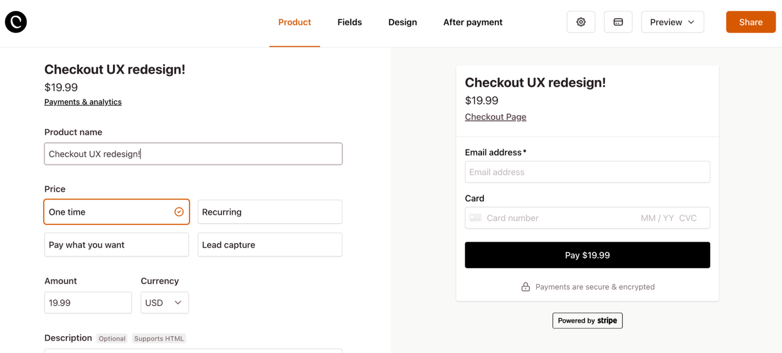
Taking a closer look at the redesign, these are the goals that guided us:
- Make the steps of creating a checkout clearer
- Reduce clutter & introduce more calmness into the design
- Make sharing checkouts from the dashboard & after creating a checkout easier
- Add variants & downloads to the Product tab, as these are very much a part of the product you’re selling
- Clarify how to make test payments
We've divided creating and editing a checkout into the following phases:
- Product
- Fields
- Design
- After payment
- Settings
- Test payments
- Share
Product This is what you're selling — the digital download, subscription, product or service.
Here you’ll add your product details, price, description, images, variants & downloads.
Fields Custom fields let you capture customer information & preferences.
Design Under design, you can customize the look and feel of your checkout.
After payment Add custom after payment confirmation messages & emails. Redirect your customers after successful payment.
Settings You’ll find some of the more niche or advanced functionality here.
Test payments Check to see if everything is working as expected.
More on making test payments below.
Share Get the link to your checkout or add a pop up to your site. Or get a QR code for your customers to scan with their phones!
Center align product text
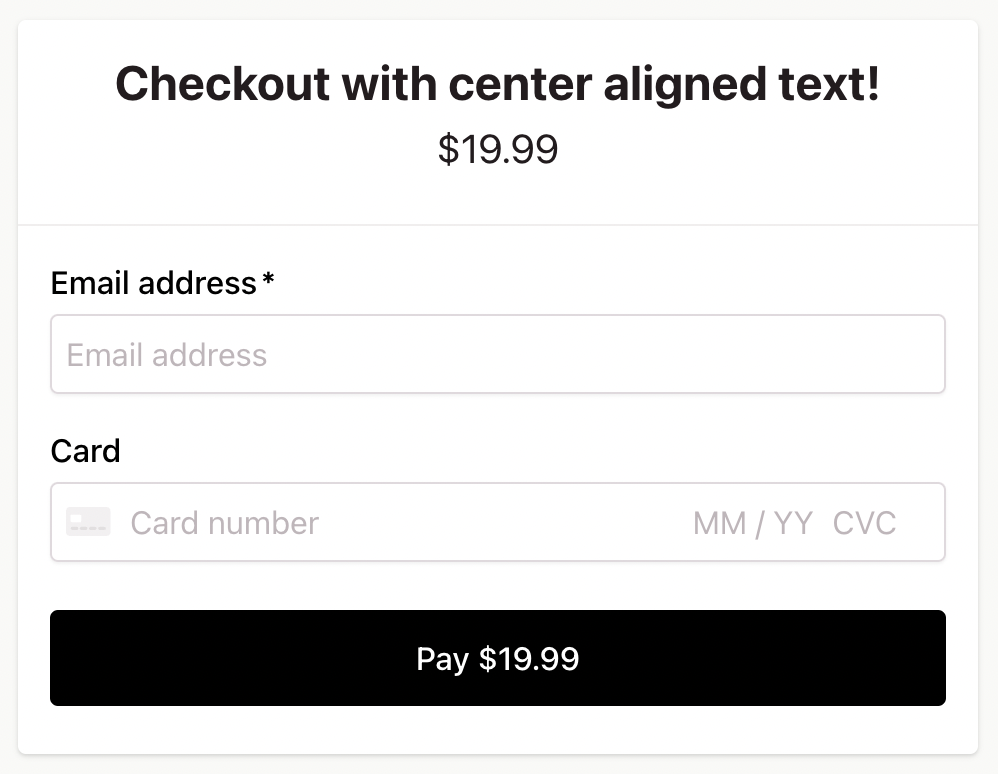
Until now, the text at the top the checkout (the product section) was left aligned.
Usually that looks great, but some of you reached out and asked for a center aligned design.
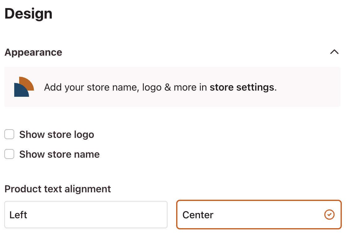
So we added it! Head over to the “Design” tab & then “Appearance” and choose between left aligned and center aligned product text.
We think this works really well for checkouts with a small amount of info and for lead capture checkouts without a price.
Making test payments
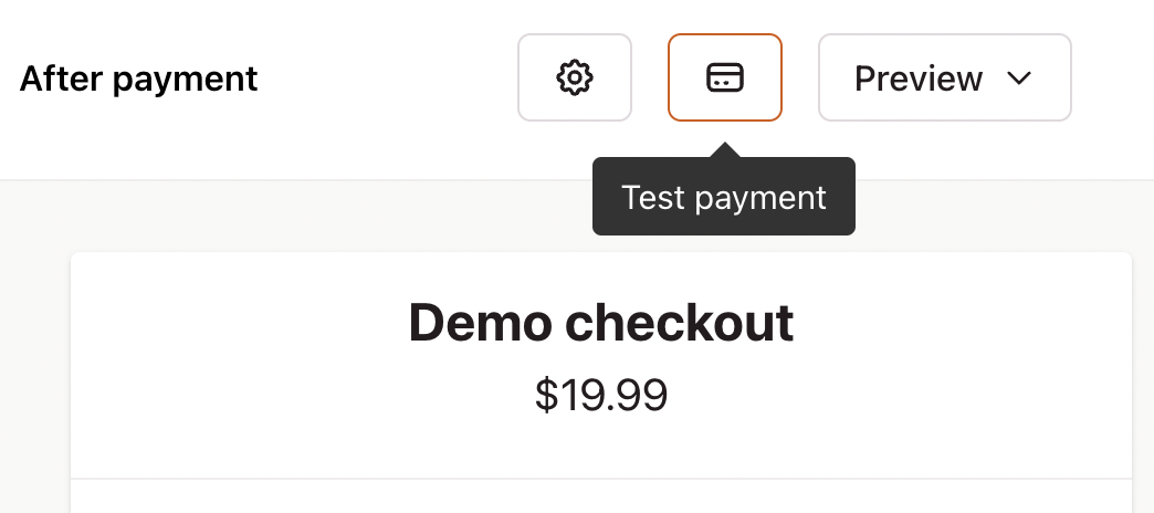
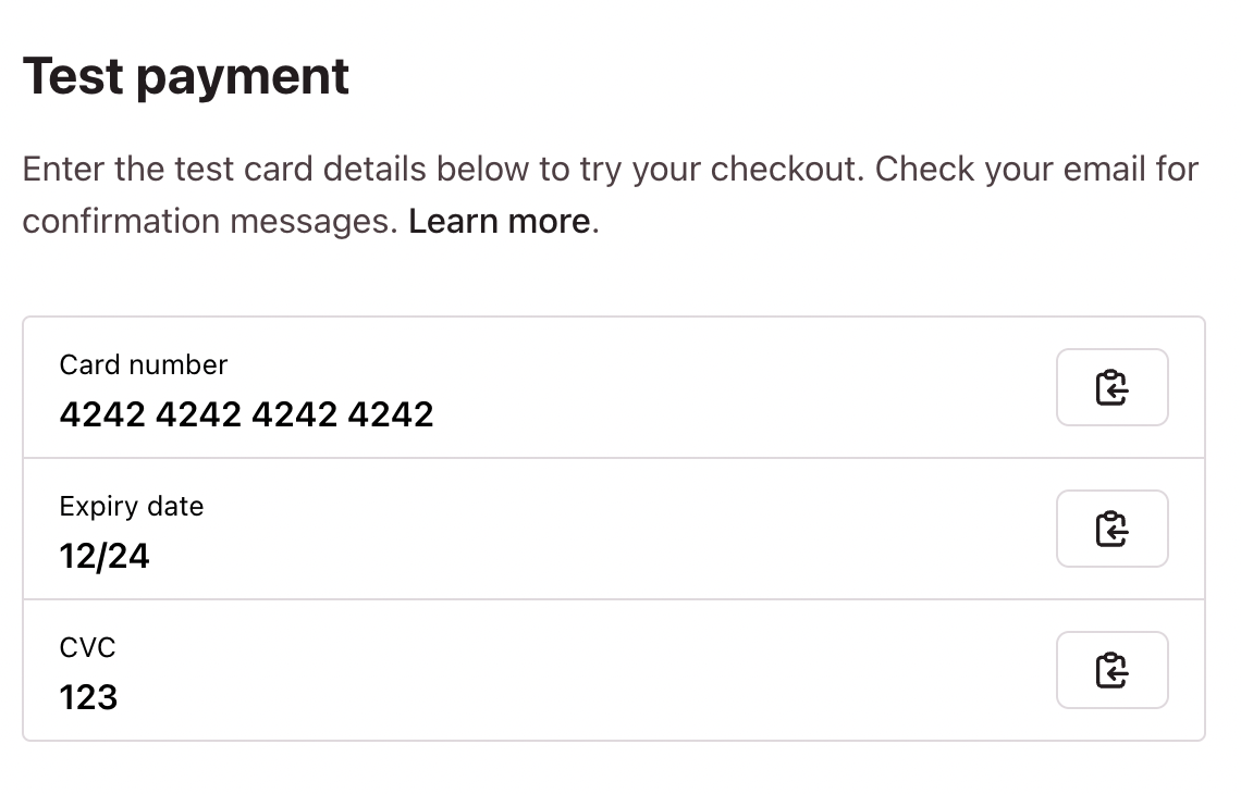
This is something that everyone should do when they get started with Checkout Page.
It helps you understand what your customers experience from start to finish — including confirmation emails and payment notifications.
We’ve tried a number of approaches to make this easy, but so far, nothing really clicked.
Now making test payments has its own dedicated section when creating a checkout.
Here you'll find test card details to use to test your checkout: does it work the way you want it to, do you want to change the messaging and are your email confirmations correct?
To learn more about making test payments, please read the How to make test payments help article.
That’s it for another update. We’re already working on the next release and we’ll be sharing some exciting updates with you soon!
In the meantime, we’d absolutely love it if you could send us a quick email telling us what you love, what we could do better, and what would make your business easier.
Thanks for your support!
Team Checkout Page
