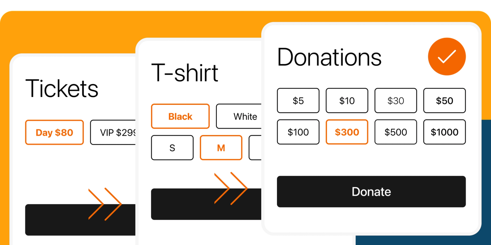
Today, we're proud to introduce a new way for you to personalize the layout of your product variants on your one-page checkout page.
You're already aware of the benefits of one-page checkouts: customers can complete their purchases quickly and efficiently, without unnecessary clicks or waiting for pages to load. This streamlined process saves time, boosts customer satisfaction, and reduces cart abandonment rates.
In the past, product variants on your checkout page were displayed in a vertical list format. While it worked well for a few options, we understand that it could become overwhelming and space-consuming with a more extensive selection.
That's why we're thrilled to introduce our new feature that enables you to display product variants in a grid layout! Now you can choose the number of columns you prefer, making the checkout experience more visually appealing and easy to navigate for your customers. Get ready to enjoy an improved and customizable checkout experience with this grid layout upgrade!
Key takeaways
- Flexible layout options: Choose between list and grid layouts for your product variants, allowing you to tailor the presentation to your unique needs and preferences.
- Customizable variant elements: With just a few clicks, easily show or hide elements in your product variants, unlocking new use cases and giving you greater control over your checkout experience.
- Enhanced design and UX: We've implemented a series of design and user experience improvements to simplify the process of creating product variants.
The power of grid layouts for product variants
Now you have the option to select our new grid layout for your product variants. This fresh feature empowers you to tailor your checkout to specific use cases, such as displaying color and size grids, presenting suggested donation amounts, or showcasing different ticket type pricing, and many others.
By combining the grid layout with the ability to hide elements like variant names, option names, prices, or price signs (+), you can completely revamp the way you showcase product variants on your checkout page. In turn, this greatly enhances your customers' checkout experience, making it more visually appealing and user-friendly.
How to display your variant as a grid
- Open your Checkout Page dashboard and click on your checkout
- Navigate to Variants
- Edit your variant
- Open Layout
- Choose Display as Grid
- Choose the number of columns that best suits your needs
Additional layout options
- Collapse variant: Ideal for conserving space on your checkout page.
- Show/Hide variant name: Perfect when your variant is self-explanatory, described in the product description text, or when you want to save space.
- Show/Hide option name: Remove repetitive option names and direct your customers' focus on the price.
- Show/Hide option price: Control the visibility of option prices based on your needs.
- Show/Hide price sign (+): Conceal the "+" in front of option prices, ideal for use cases like "Suggested Donations" or "Ticket Prices."
Let’s explore the amazing possibilities that our new grid product variant layouts offer to turbocharge your one-page checkout experience today!
Sell T-shirt color and sizes
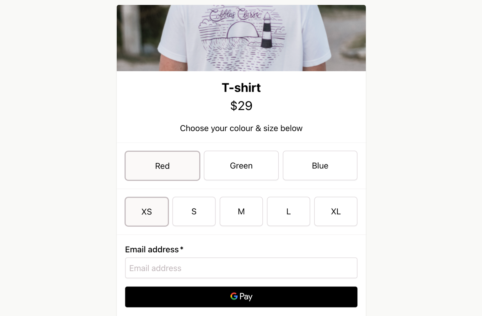
Presenting both color and size variants in a grid format enhances selection ease and accelerates your customers' checkout experience.
Sell event tickets online
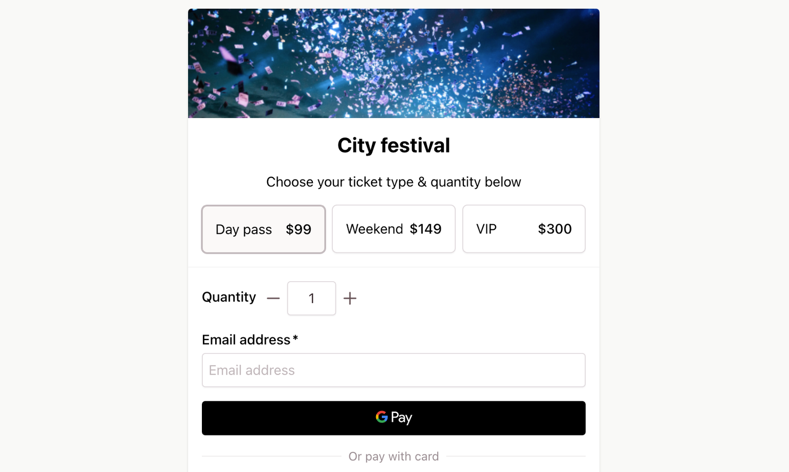
Showcasing ticket types in a grid layout reduces clicks and simplifies ticket type comparison for customers.
Training course dates
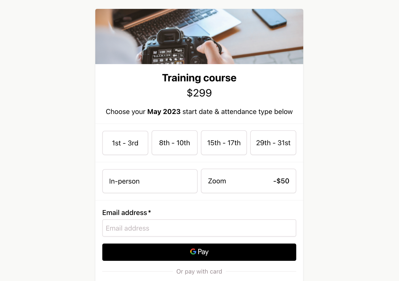
Presenting event dates and attendance options in a grid format allows course attendees to easily identify different start dates and select their preferred option without any extra clicks.
Donations form
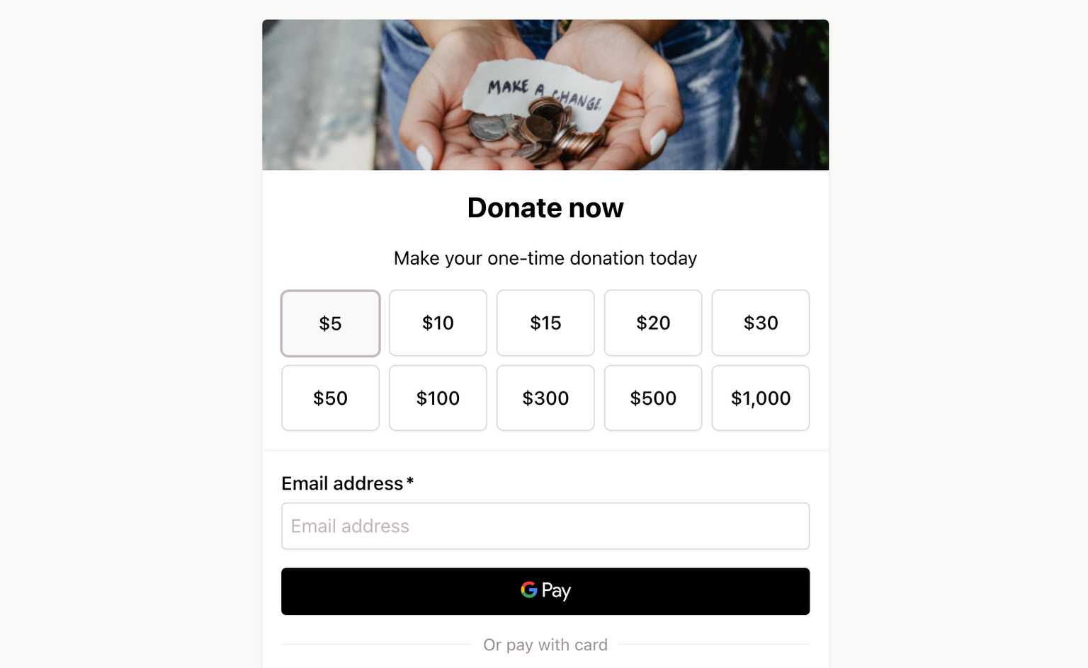
Displaying suggested donation amounts in a grid with center-aligned text and hidden option price signs (+) makes it easy for your customers to select a donation amount.
Sell digital products variations
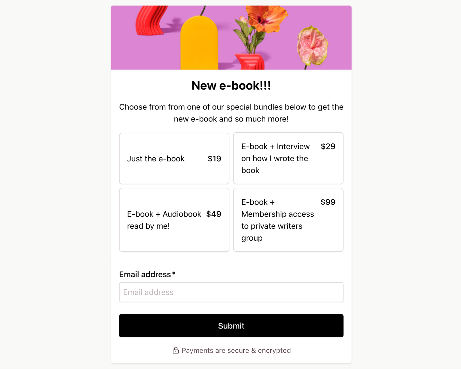
Showcasing digital product details in a grid format makes the selection more appealing and engaging for your customers to choose from.
Improvements to vertical list layout for product variants in one-page checkouts
We've made some notable improvements to the existing vertical list format for product variants on your one-page checkout.
By default, all new variants will now be displayed as lists in your checkout, streamlining the process of creating new products.
For variants with just a few options, where space isn't a concern, displaying your variants as lists can simplify the selection process for your customers. This approach reduces clicks and ensures that all available options are always visible.
If you find that a variant takes up too much space or you have multiple variants, we recommend selecting the Collapse variant option under the new Layout variant settings. This feature hides your variant options behind a dropdown, keeping your checkout page neat and organized.
These enhancements to the vertical list format aim to provide you with even more flexibility and control over your product variants in one-page checkouts, optimizing the overall user experience
How to collapse your list or grid variant
- Open your Checkout Page dashboard and click on your checkout
- Navigate to Variants
- Edit your variant
- Open Layout
- Check Collapse variant
Sell products or services that require configuration
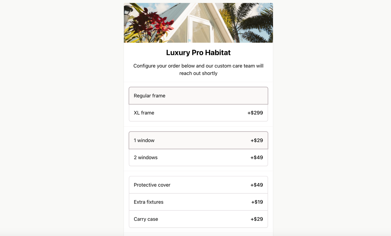
Presenting each variant as an expanded list simplifies the process of selecting the desired configuration across multiple product variants for your customers. This approach is best suited for situations where space is not a concern or when using multi-step checkouts.
Thank you for taking the time to read about our latest update to Checkout Page's one-page checkout.
We encourage you to try out the new grid layouts and explore the amazing possibilities they offer to supercharge your one-page checkout experience today.
Thank you for choosing Checkout Page and happy selling!
